Damascene
The dressed-up one.
Andada Pro Medium over Jost on a blush ground, plum where the moss was, and every product image cropped square. Built for a catalog where the object is small, the price is not, and the photograph is the whole argument.
Color
The Damascene palette.
Blush, shell and a deeper rose for the papers. Wine and near-black under them. Plum carries the links on the light schemes, and gold takes the dark ones. Those are the two metals the catalog is already full of. A sixth scheme, Editorial, reuses the lightest blush and moves the headings and buttons to plum, for bands that want to be quieter still.
- Paper #F6EBE3
- Ecru #F0E0D4
- Mat #E7D2C2
- Dusk #462A31
- Night #2E1219
Type & shape
Andada Pro Medium on Jost.
Andada Pro at medium weight. It is a sturdy text serif with calligraphic detail, set large enough for that detail to read. It is heavier and wider than a display serif would be here, and that is the point. A jewelry page is mostly white, so the headings have to hold it. Jost keeps the running text plain and geometric, giving the serif something to work against.
Headings
Andada Pro Medium
ABCDEFGHIJKLM abcdefghijklm 0123456789
Body
Jost
Every price, size chart, care note and shipping line on the storefront is set in this face. It is the one a shopper reads the longest, so it is chosen for a paragraph rather than for a headline.
Shape
Square corners, square product images
Every corner at zero, on media, cards, inputs and buttons alike. Product images crop square, so a ring reads the same size as a chain beside it and the grid stays even the whole way down.
The live store
Damascene, on a real storefront.
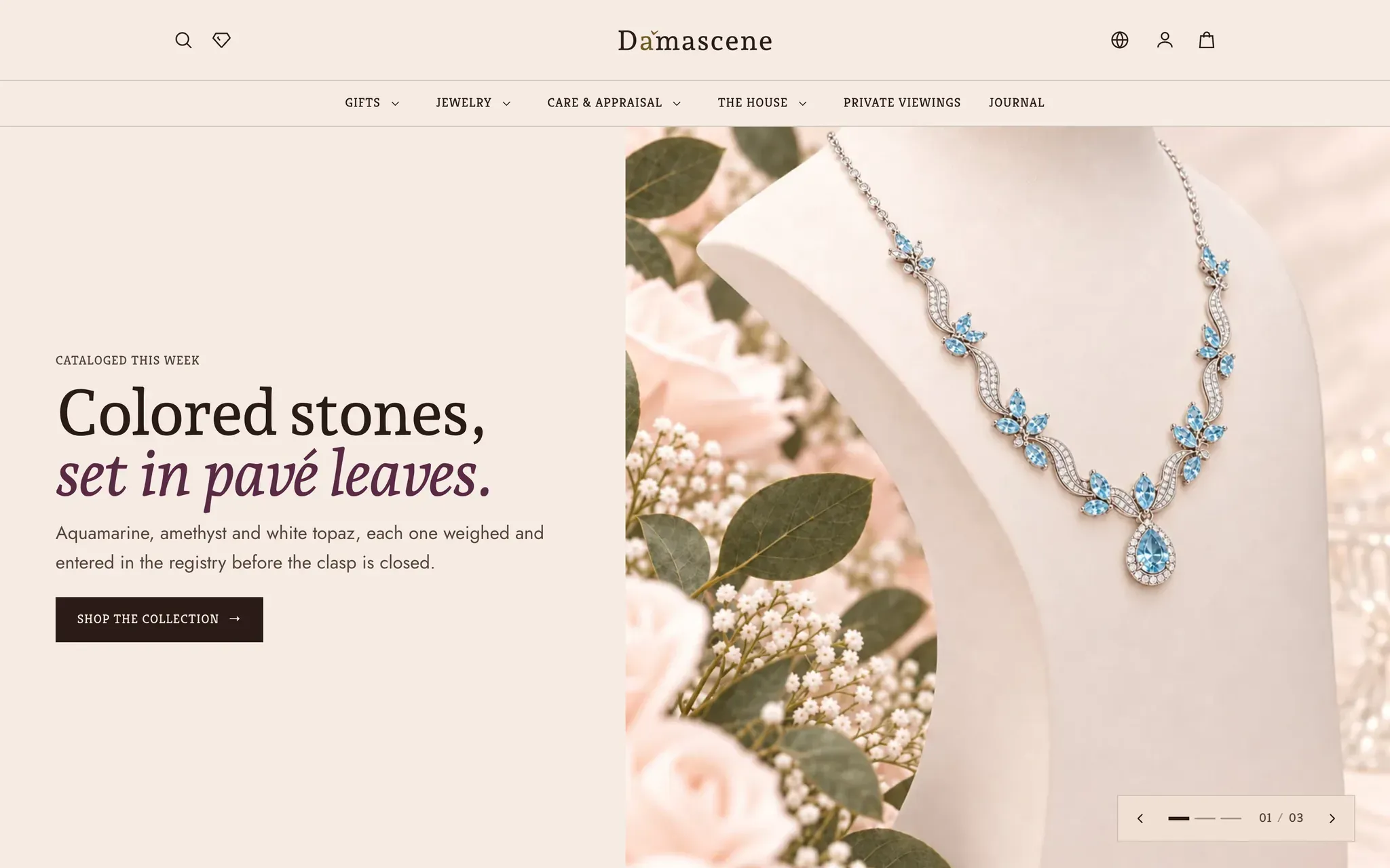
Six screens from a fine-jewelry store running Lapels in the Damascene preset. Same theme, same sections, different preset.
-
Home -
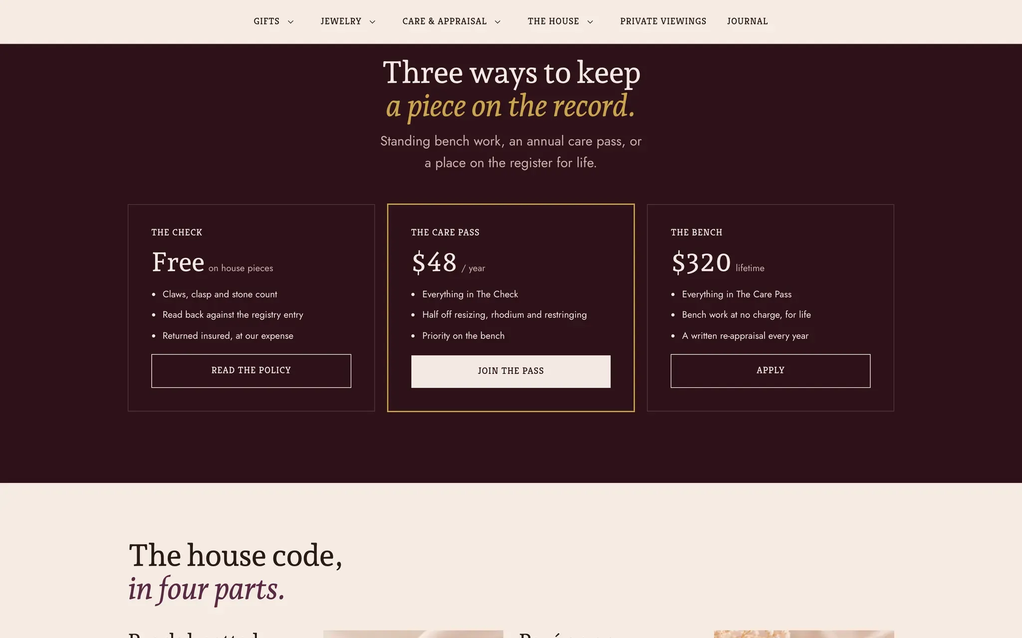
A dark scheme -
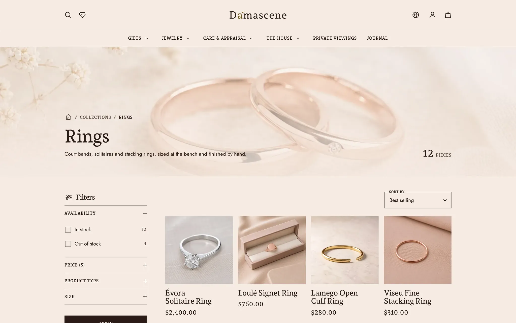
Collection -
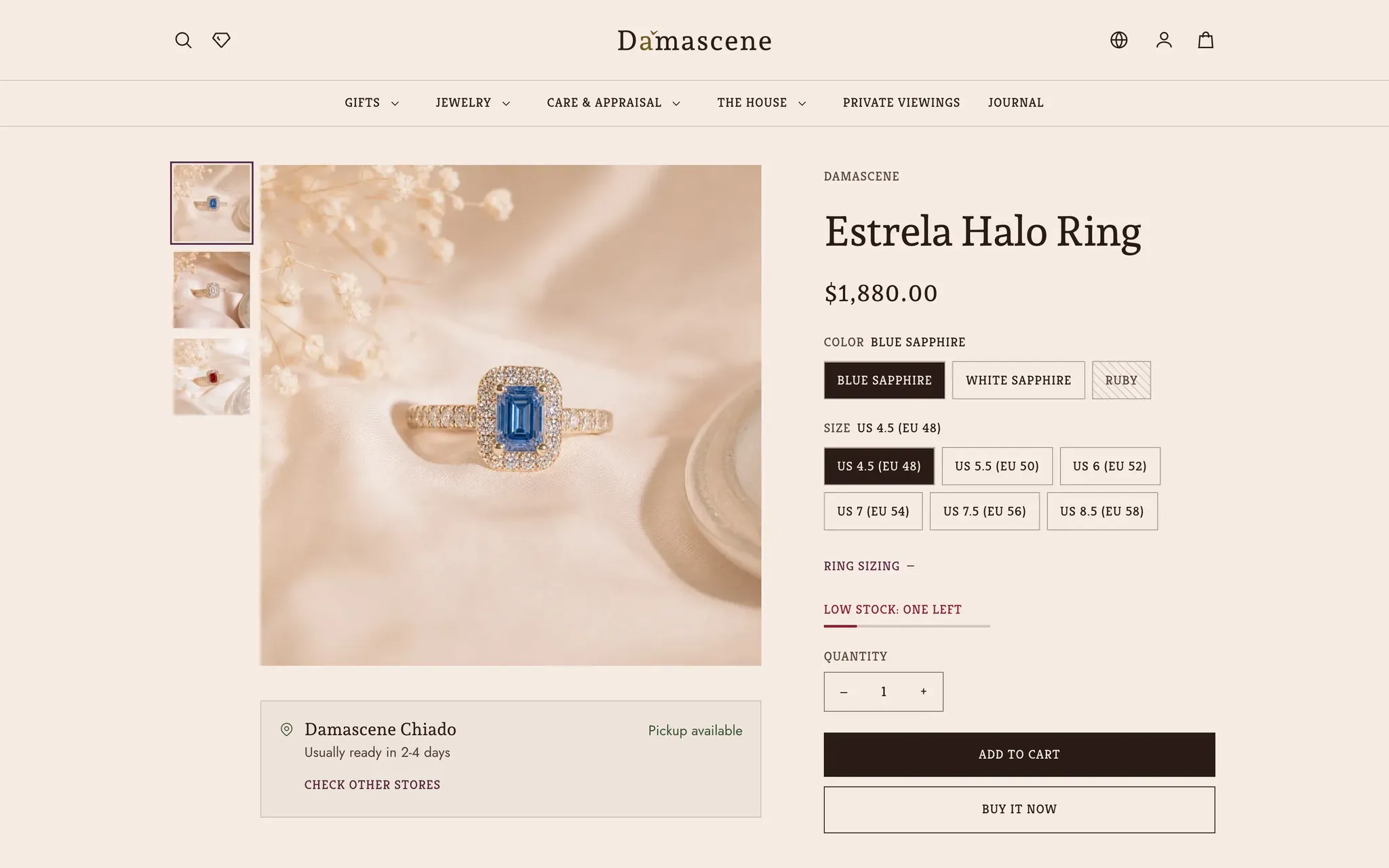
Product page -
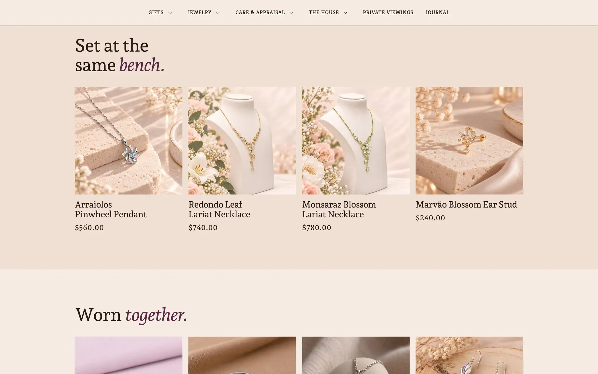
Related products -
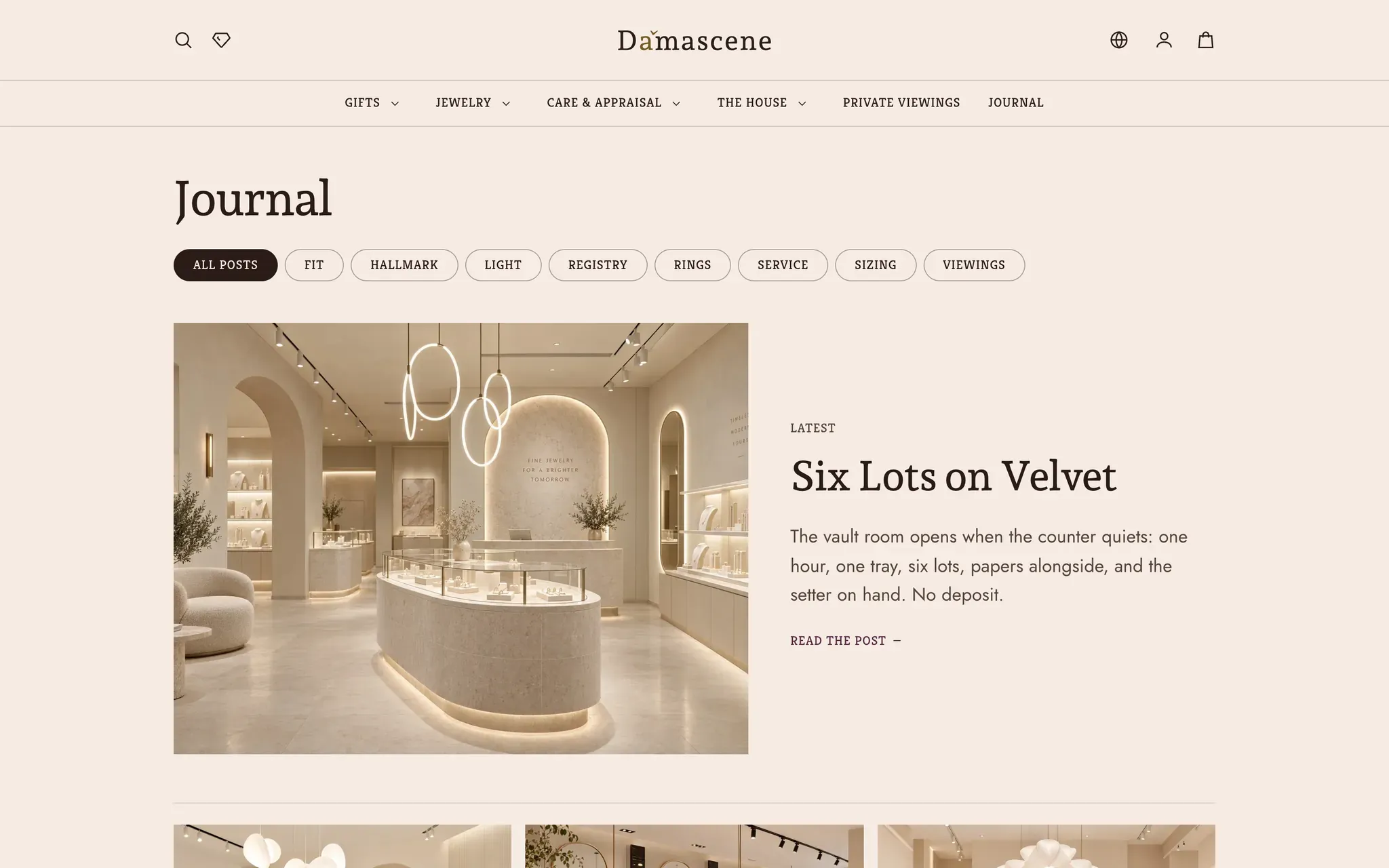
Journal
The others
Lapels ships three presets.
One theme, one license. Switch preset in the theme editor and the storefront restyles without touching a word of your content.
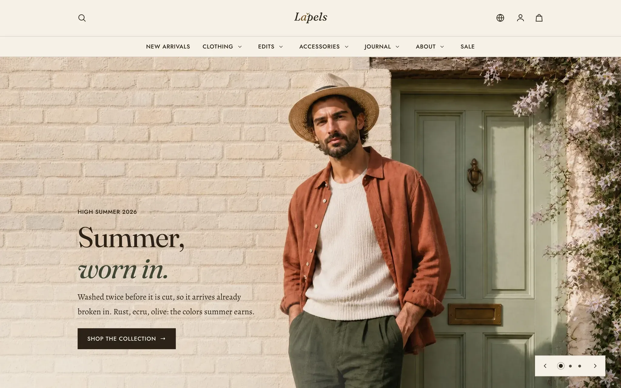
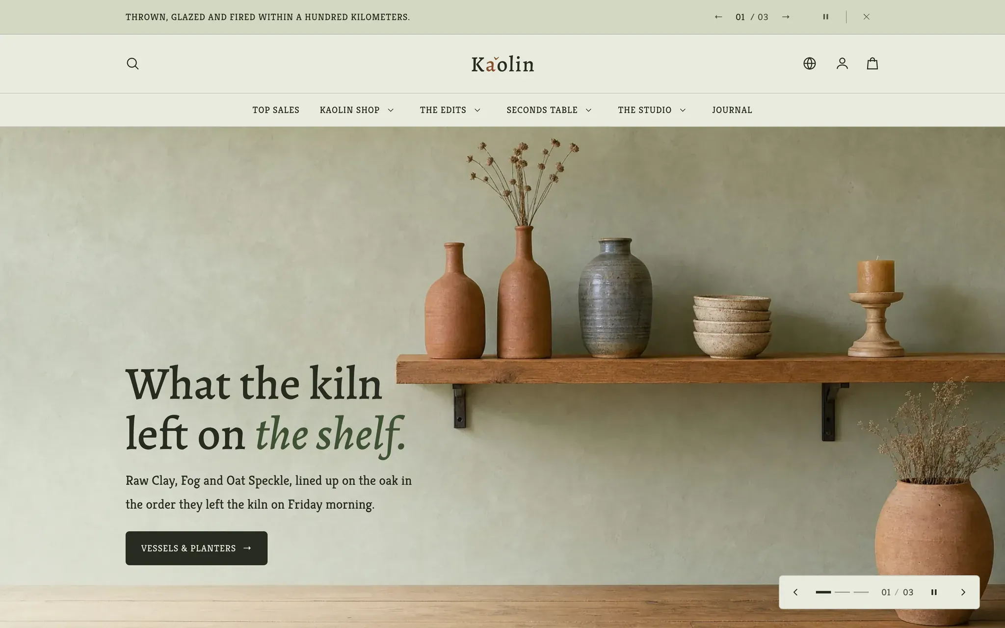
Every preset is the same theme.
Damascene is one of Lapels's built-in presets. No extra license, no separate install. Pick it when you add the theme, or switch to it later.