Footer
The footer is the band at the bottom of every page. In Torquex it is one Footer section that combines a brand area (logo, description, social links, newsletter), three configurable columns of blocks, and a bottom bar with your copyright and payment icons. This page covers every footer setting, each block you can add to a column, and how to build the navigation menus the footer links to.
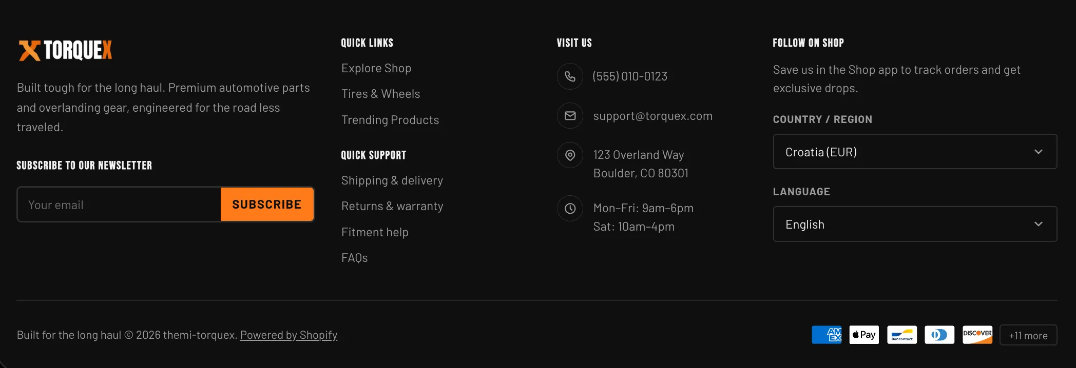
The footer lives in the Footer section group, so it renders on every template automatically — you do not add it page by page. To edit it, open Customize, then in the editor’s section list open the Footer group and select the Footer section (the group can also hold other sections, such as a marquee or service bar, above the footer).
Footer layout at a glance
Section titled “Footer layout at a glance”The footer is built from two rows inside one section:
- Top row — on the inline-start side, the brand area (logo, brand description, social icons, and newsletter). On the inline-end side, three columns of merchant-managed blocks. On wide screens the three columns sit side by side; on small screens everything stacks vertically.
- Bottom bar — your copyright line on one side and payment icons on the other. When payment icons are hidden, the copyright line is centered.
The three columns are fixed slots: you cannot add or remove columns, but you can fill each one with any combination of the footer blocks described below, and you can give each column its own heading.
Footer section settings
Section titled “Footer section settings”Select the Footer section in the editor. Its settings are grouped under these headers.
| Setting | What it does | Default |
|---|---|---|
| Footer logo | An optional image used as the footer logo. If you leave it empty, Torquex falls back to your global logo (chosen automatically for the footer’s color scheme), and if no logo is set anywhere it prints your store name as text. | Empty |
| Brand description | Rich-text shown under the logo — a short line about your store. | ”Built tough for the long haul. Premium automotive parts and overlanding gear, engineered for the road less traveled.” |
The brand area also shows your social icons automatically (see Social icons below) and the newsletter form.
Newsletter
Section titled “Newsletter”| Setting | What it does | Default |
|---|---|---|
| Newsletter heading | Heading above the email signup form. | ”Subscribe to our newsletter” |
| Subheading | Optional supporting line under the heading. Leave blank to hide it. | Empty |
The signup form sits in the brand area. See Newsletter signup for how it works.
Bottom bar
Section titled “Bottom bar”| Setting | What it does | Default |
|---|---|---|
| Copyright text | The text that begins your copyright line. Torquex appends © <current year> <your store name>. and the “Powered by Shopify” link after it automatically — so enter only your own phrase, not the year. | ”Built for the long haul” |
| Show payment icons | Shows the icons for the payment methods your store accepts in the bottom bar. | On |
| Maximum payment icons | How many payment icons to show inline before the rest collapse behind a “+N more” button (range 4–12). Only visible when Show payment icons is on. | 5 |
See Copyright line and Payment icons for details.
Layout
Section titled “Layout”| Setting | What it does | Default |
|---|---|---|
| Color scheme | The color palette applied to the whole footer. Schemes are defined once in Theme settings → Colors and reused; choosing one here only selects which palette the footer uses. | Scheme 1 |
Footer columns
Section titled “Footer columns”The footer has three column slots. Each is a Footer column block with one setting:
| Setting | What it does |
|---|---|
| Heading | An optional heading printed above the column’s blocks. Leave it blank to omit the heading (useful when the first block already carries its own heading). |
You fill each column by adding blocks inside it in the theme editor. A single column can hold any mix of the block types below, in any order. The block types you can add to a footer column are:
- Footer menu — a list of navigation links from a menu.
- Footer contact row — one line of contact info (address, phone, email, hours) with an icon.
- Country / region selector — lets shoppers switch country and currency.
- Language selector — lets shoppers switch storefront language.
- Follow on Shop — the Shopify “Follow on Shop” button.
- App blocks are also supported, so a compatible app can add its own footer content.
To add a block: in the editor, open the Footer section, expand the column you want, and click Add block, then pick the block type. Drag blocks to reorder them within the column.
Beyond the columns, the Footer section itself also accepts a Custom Liquid block for advanced custom content — drop in your own HTML or Liquid (for example a payment-icon row or a compliance badge) without editing theme files. Add it from the Footer section’s Add block menu, alongside Footer column and app blocks.
Footer menu block
Section titled “Footer menu block”A Footer menu block renders a vertical list of links pulled from one of your navigation menus.
| Setting | What it does | Default |
|---|---|---|
| Heading | Optional heading shown above the link list (for example “Quick Links” or “Customer Care”). | Empty |
| Menu | The navigation menu whose links are listed. Pick any menu you built in Online Store → Navigation. | Footer |
The block prints every top-level link in the chosen menu, in the menu’s order. The link for the page a shopper is currently on is marked as the current page for accessibility. If the menu has no links, the block renders nothing.
Building a footer menu
Section titled “Building a footer menu”Footer menus are built in Shopify’s navigation tool, not in the theme editor:
Open Navigation
Go to Online Store → Navigation.
Open or add a menu
Open the Footer menu (Shopify creates one by default) or click Add menu to create a new one — for example a “Customer Care” or “Information” menu.
Add menu items
Add menu items: give each a Name (the visible link text) and a Link (a page, collection, product, policy, blog, or external URL).
Save the menu
Save the menu.
Link it in the editor
Back in the theme editor, open the Footer menu block and set its Menu setting to the menu you just built.
The column now shows your menu. Repeat to add as many footer menus as you like across the three columns — a common pattern is one menu per column, each with its own heading.
Footer contact row block
Section titled “Footer contact row block”A Footer contact row block prints one line of contact information with a leading icon. Add several of them to build a “Visit Us” or “Contact” column.
| Setting | What it does | Default |
|---|---|---|
| Icon | The icon shown before the text. Choose Location, Phone, Email, Clock, or None. | Location |
| Text | The contact text. Multiple lines are supported — press Enter to wrap (for example a street address over two lines, or store hours over several lines). | Two lines: “123 Overland Way” then “Boulder, CO 80301” |
| Link | Optional. When set, the text becomes a clickable link. Use a full URL (https://…), tel: for a phone number, or mailto: for an email address. | Empty |
The contact-row icons (plus None):
Each block is a single row, so add one block per piece of information (one for the address, one for the phone, one for the email, one for hours). The text wraps in a bidirectional element, so it displays correctly in right-to-left languages.
Country / region selector block
Section titled “Country / region selector block”The Country / region selector block adds a dropdown that lets shoppers choose their country and currency. It updates the storefront to the market they pick.
This block has nothing to configure — it is driven entirely by your markets, and the only thing in its editor panel is an info note (“Appears only when more than one country is published in Settings → Markets”). It appears only when more than one country is published in Settings → Markets. If your store sells to a single country, the block renders nothing, so it is safe to leave in place.
Each option shows the country name and its currency code, e.g. “United States (USD)”. To control which countries and currencies appear, configure them in Settings → Markets in your Shopify admin.
Language selector block
Section titled “Language selector block”The Language selector block adds a dropdown for switching the storefront language.
Like the country selector, it has nothing to configure — its editor panel shows only an info note (“Appears only when more than one language is published in Settings → Markets”) — and it appears only when more than one language is published in Settings → Languages. Each option shows the language in its own name (its endonym). Publish and manage your storefront languages in Settings → Languages.
Follow on Shop block
Section titled “Follow on Shop block”The Follow on Shop block renders Shopify’s branded Follow on Shop button, which lets customers save your store in the Shop app to track orders and get updates.
| Setting | What it does | Default |
|---|---|---|
| Heading | Optional heading above the button. | Empty |
| Description | Optional supporting text under the heading. | ”Save us in the Shop app to track orders and get exclusive drops.” |
The button itself is generated and styled by Shopify and cannot be restyled by the theme. It works with Shopify’s built-in Shop channel — no third-party app is required.
Newsletter signup
Section titled “Newsletter signup”The newsletter form sits in the footer brand area, under the brand description and social icons. Its heading and subheading come from the Newsletter settings above.
The form collects an email address and submits it to Shopify’s customer list, tagging each subscriber with newsletter so you can find them in Customers. On a successful submission the shopper sees a thank-you message inline; if there is an error (for example an invalid email) the error is shown inline. The email field is set to left-to-right input and labelled for screen readers.
Social icons
Section titled “Social icons”Below the brand description, Torquex automatically shows a row of social icons. There is no social setting in the footer section — the icons come from your global social links.
Set your social profile URLs in Theme settings → Social media. Torquex supports: Instagram, YouTube, Facebook, TikTok, X, LinkedIn, Pinterest, Threads, Snapchat, Vimeo, and Tumblr. An icon appears only for each URL you fill in; if you leave every social URL blank, the row renders nothing. Each icon opens the profile in a new tab and is labelled for screen readers.
Payment icons
Section titled “Payment icons”When Show payment icons is on, the bottom bar shows the icons of the payment methods your store actually accepts. The list comes straight from your enabled payment providers in Settings → Payments — you do not pick icons manually, and if no payment methods are enabled, nothing is shown.
Maximum payment icons controls how many show inline (4–12). If your store has more enabled methods than that, the extras collapse behind a “+N more” button. Clicking it opens a small popover listing every accepted method; it can be closed with its close button, by clicking outside, or with the Escape key, and is keyboard-accessible.
Copyright line
Section titled “Copyright line”The copyright line is built automatically. Torquex prints, in order:
- Your Copyright text (from the Bottom bar settings).
© <current year>— the year updates itself; do not type it.- Your store name, followed by a period.
- The “Powered by Shopify” link.
So if your Copyright text is “Built for the long haul”, the line reads: Built for the long haul © 2026 Your Store Name. Powered by Shopify. The text supports inline rich-text formatting and links.
Accessibility and internationalization
Section titled “Accessibility and internationalization”The footer is built to Torquex’s accessibility standard (WCAG 2.1 AA): the footer is a landmark region, every menu and selector is labelled, links indicate the current page, the payment “+N more” popover traps focus and closes on Escape, and all icon-only controls have screen-reader labels. Footer text and layout mirror correctly for right-to-left (RTL) languages, and the country/language selectors integrate with Shopify Markets. See Performance & accessibility.
Related pages
Section titled “Related pages”- Header & navigation — the matching header section, menus, and localization panel.
- Theme settings — global logo, color schemes, and social links used by the footer.
- Sections — additional newsletter and promotion placements.
Related: Header & navigation · Announcement bar · Torquex support replies within 12 hours.