Blog & pages
Torquex ships dedicated templates for your editorial and informational content: a blog index, individual articles, standard pages, and a ready-made contact page. Every template is built on Online Store 2.0, so you arrange and configure it visually in the theme editor — no code or third-party apps required. This page covers how to create each content type in your Shopify admin, which section powers each template, and the flexible content sections you can drop onto any page.
How content templates work
Section titled “How content templates work”In Shopify, your content lives in the admin (the blog post, article body, page body) while the template controls how that content is presented. Torquex provides one template per content type, each driven by a single “main” section:
| Content type | Where you create the content |
|---|---|
| Blog index | Online Store → Blog posts (the Blog) |
| Article | Online Store → Blog posts (a Blog post) |
| Standard page | Online Store → Pages |
| Contact page | Online Store → Pages (assign the Contact template) |
You edit the content in the admin and the presentation (which sections show, their settings, colors, spacing) in the theme editor under Customize. Because these are Online Store 2.0 templates, you can also add extra sections and app blocks to most of them.
Create a blog and articles
Section titled “Create a blog and articles”Shopify stores articles inside blogs. A fresh store comes with one blog called News.
- In your Shopify admin, go to Online Store → Blog posts.
- To add a post, click Create blog post. Give it a Title, write the body in the content editor, and optionally add a Featured image, an Excerpt, Tags, and an Author.
- To organize posts into a separate blog (for example a “Build journal” or “How-to” blog), open the Blog post editor, and under Organization → Blog, choose Manage blogs → Add blog. Each blog gets its own URL and its own listing page rendered by the blog template.
- Set Visibility to publish immediately or schedule for later.
Several Torquex features read these admin fields directly:
- Featured image drives the article card image on the blog index, the article hero image, and the article’s social-share/SEO image.
- Excerpt (or the start of the body if no excerpt is set) becomes the card summary and the article’s meta description.
- Tags power the blog’s tag filter, the per-article tag links, and the “Related posts” matching on the article page.
- Author shows in the article and card meta when you enable the author display.
- Comments appear on the article only when you enable them for that blog (see Comments).
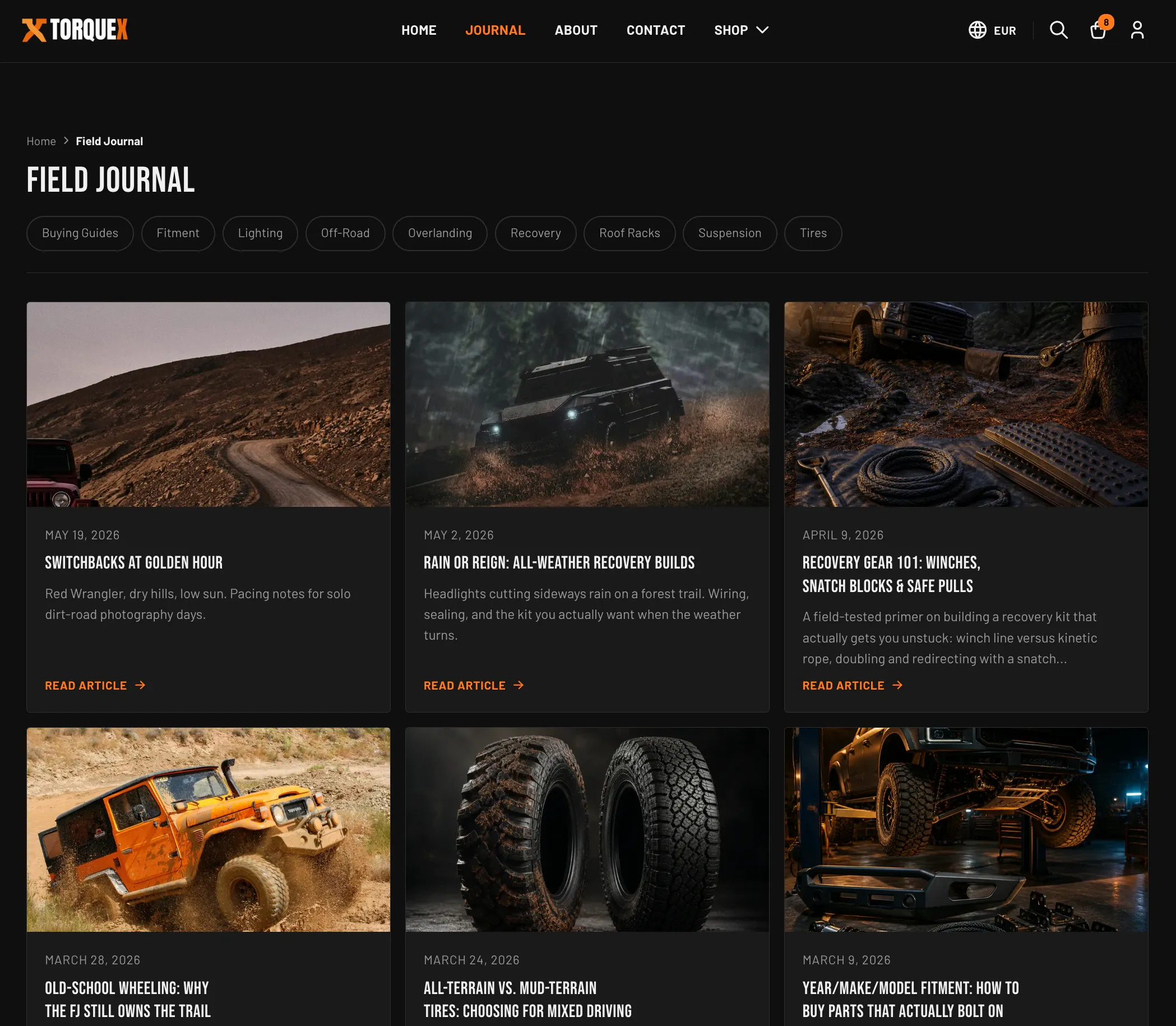
Blog index
Section titled “Blog index”The blog listing page is rendered by the Blog posts section. It shows your store breadcrumbs, the blog title, an optional tag filter, and a paginated grid of article cards. Each card links to the article, and clicking a tag filters the list to that topic (with an All topics link to clear the filter).
Configure it in the theme editor by opening a blog page in the page selector and editing the Blog posts section’s settings:
| Setting | What it does | Default |
|---|---|---|
| Show post excerpt | Shows the article excerpt (or trimmed body) under each card title. | On |
| Show publication date | Shows the article’s publish date in the card meta. | On |
| Show post author | Shows the author name in the card meta (only if the article has an author). | Off |
| Columns (desktop) | Number of card columns on desktop (1–4). Tablet always shows two, mobile one. | 3 |
| Posts per page | How many articles per page before pagination (3–18, in steps of 3). | 9 |
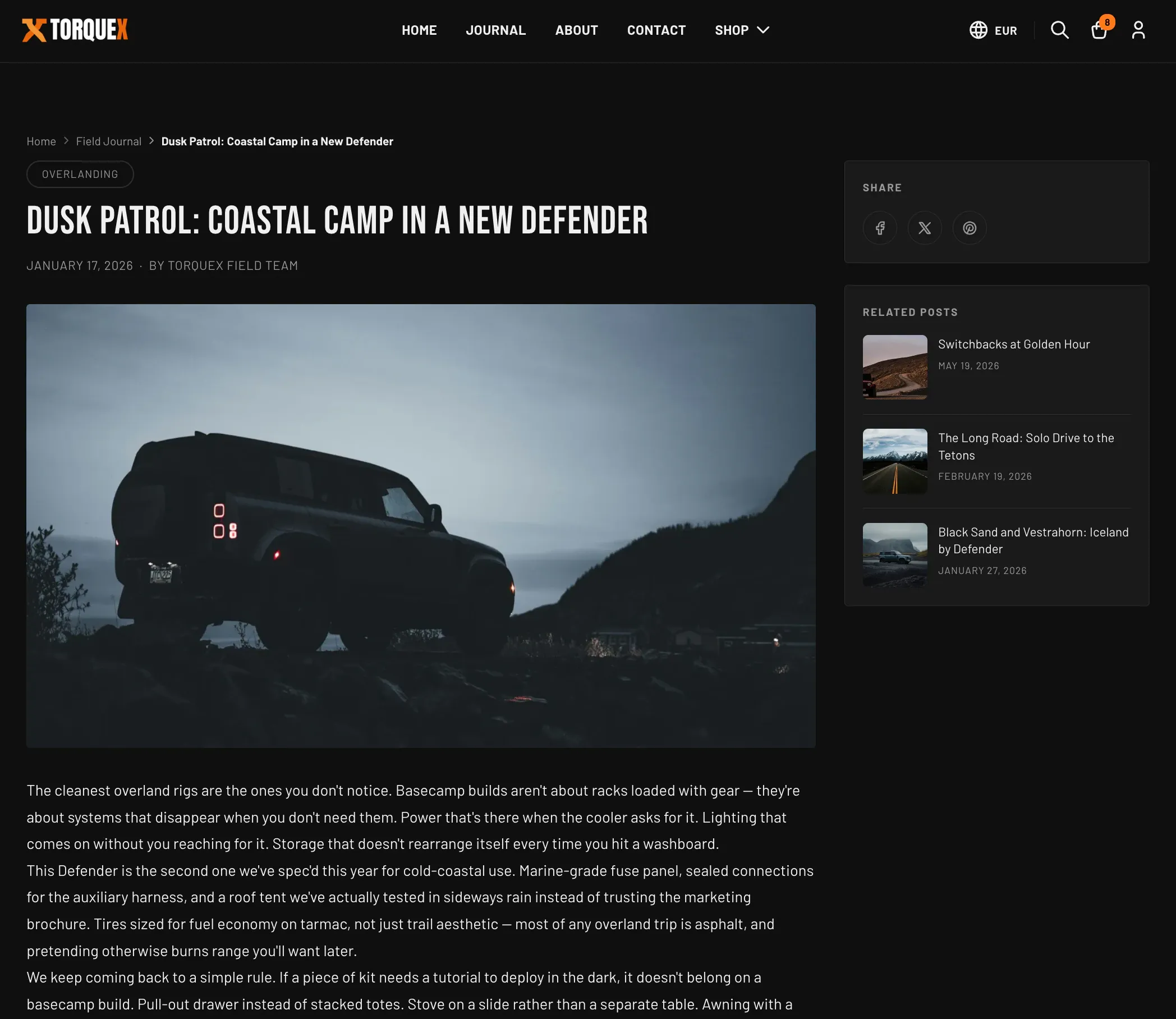
Article page
Section titled “Article page”Individual articles are rendered by the Article section. It lays out breadcrumbs, the article’s tags, title and meta, the featured image as a hero, the article body, an optional sidebar (social share + related posts), comments, and a “Back to blog” link. On wide screens the sidebar sits beside the article; if both sidebar features are off it collapses to a single column.
Edit a blog post in the page selector and open the Article section’s settings:
| Setting | What it does | Default |
|---|---|---|
| Show date | Shows the publish date in the article meta. | On |
| Show author | Shows the author name in the article meta (only if set). | On |
| Show social media share links | Shows the share sidebar with Facebook, X, and Pinterest links. | On |
| Show related posts (matched by tag) | Shows a “Related posts” list in the sidebar, matched to other articles sharing a tag. | On |
| Max related posts | Maximum number of related posts to list (2–6). Only visible when related posts are on. | 3 |
| Show “Back to blog” link | Shows a link back to the blog index below the article. | On |
| Comments per page | Comments shown per page before pagination (5–30, in steps of 5). | 5 |
Torquex also outputs BlogPosting structured data (JSON-LD) for every article — headline, description, image, publish/modified dates, author, and publisher — so search engines can read your articles correctly. This is automatic and requires no setup.
Comments
Section titled “Comments”The comment form and existing comments only appear on the article when comments are enabled for that blog in your Shopify admin:
- Go to Online Store → Blog posts → Manage blogs, open the blog, and find Comments.
- Choose Comments are allowed, pending moderation (recommended) or Comments are automatically published, then save.
With comments enabled, Torquex shows the comment count, the existing comments (long comments collapse with a Read more toggle), and a Name / Email / Message form. If your blog moderates comments, submitters see a “pending approval” message; otherwise the comment posts immediately.
Create standard pages
Section titled “Create standard pages”Use pages for evergreen content like About, Shipping, Warranty, or an FAQ.
- In your Shopify admin, go to Online Store → Pages → Add page.
- Enter a Title and write the body with the content editor (headings, lists, links, and images are all styled by the theme).
- Set Visibility, then Save.
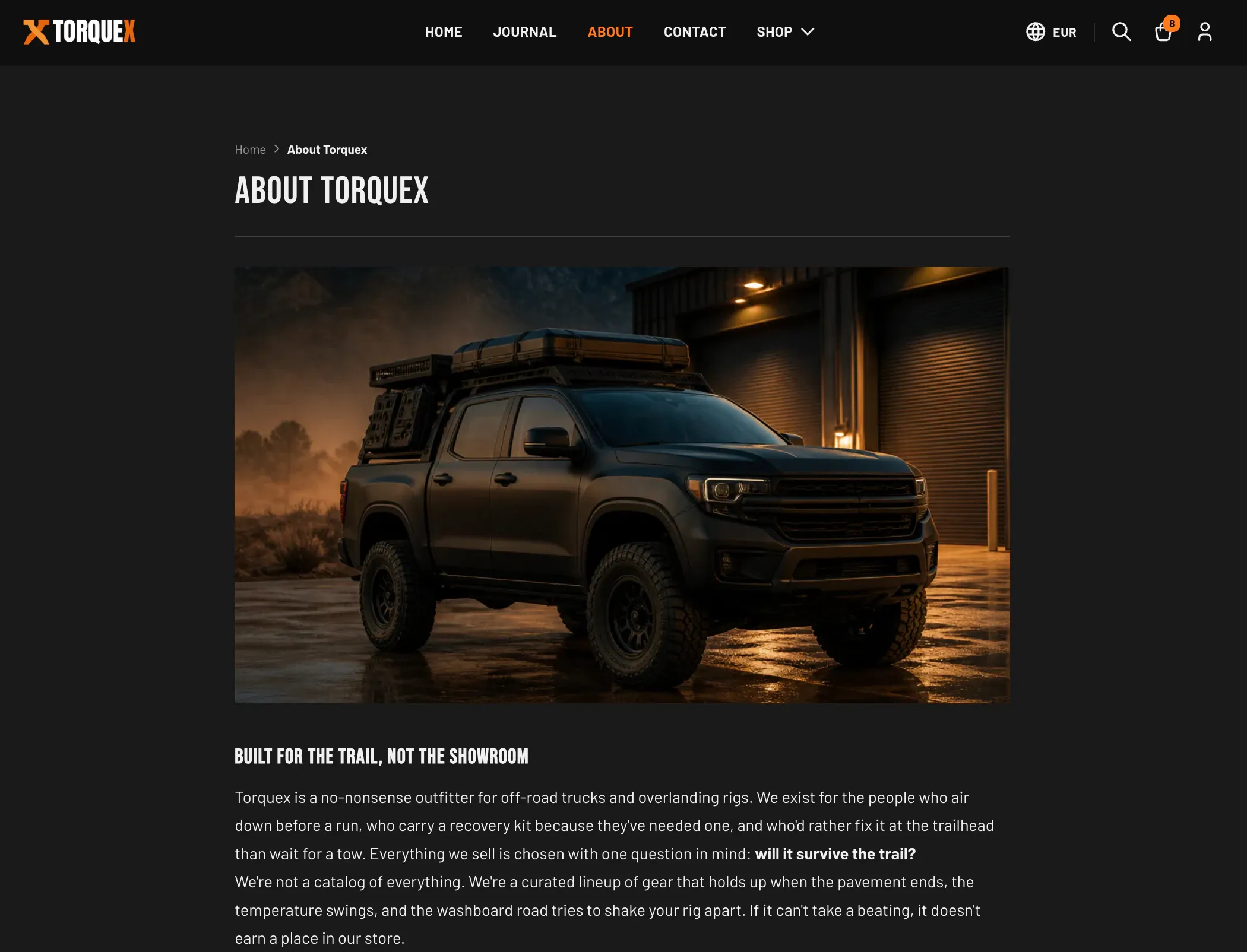
A page uses the default page template, rendered by the Page section. It shows breadcrumbs, an optional page title, and your page body styled as rich text. Open a page in the theme editor’s page selector and edit the Page section’s settings:
| Setting | What it does | Default |
|---|---|---|
| Show page title | Shows the page title as an <h1> above the content. Turn off if your content already includes its own heading. | On |
| Constrain width | Keeps the content in a narrower, more readable column instead of full page width. | On |
You can add extra sections (for example Rich text, Image with text, or Custom Liquid — see Flexible content sections) above or below the page body in the theme editor.
Create alternate page templates
Section titled “Create alternate page templates”If you want some pages to look different (for example a wide landing page with no title), duplicate the template:
- In the theme editor, open the page template, then use Create template (in the page/template selector) to make a new page template — for example name it landing.
- Configure that template’s sections and settings as you like.
- In your Shopify admin, open the page, and under Online store → Theme template, choose the new template (it appears as “landing”). Save.
The same duplicate-and-assign flow works for blogs and articles too.
The contact page
Section titled “The contact page”Torquex includes a ready-built Contact page template that combines three sections in order: the Page section (for any intro copy you write in the page body), the Contact form section, and the Contact info section. It is the recommended way to build your contact page.
To use it:
- In your Shopify admin, go to Online Store → Pages → Add page (or open an existing contact page).
- Give it a title (for example “Contact”), and optionally write intro copy in the body.
- Under Online store → Theme template, choose the contact template. Save.
- Open the page in the theme editor to fill in the form and your business details.
Contact form section
Section titled “Contact form section”The Contact form section posts to Shopify’s built-in contact form endpoint — submissions are emailed to your store’s sender/contact email (set under Settings → Notifications — and your store contact email under Settings → Store details — in your admin). No app is required. It always collects Name, Email, and Message; the phone field is optional. On success it shows a confirmation message; validation errors are shown inline.
Edit the section in the theme editor:
| Setting | What it does | Default |
|---|---|---|
| Heading | Heading above the form. | ”Talk to a specialist” |
| Subheading | Supporting text below the heading. | ”Questions about fitment, install, or what to spec for your build? Send a note and a real gearhead will get back to you within one business day.” |
| Show phone field | Adds an optional phone-number field to the form. | On |
| Require phone number | Makes the phone field required. Only visible when the phone field is shown. | Off |
| Submit button label | Text on the submit button. | ”Send message” |
| Constrain width | Narrows the form card for a tighter, centered layout. | On |
The default Subheading (“…get back to you within one business day”) is sample placeholder copy — edit it to reflect your store’s actual response time.
Contact info section
Section titled “Contact info section”The Contact info section displays your business details as cards alongside an optional embedded map. Each detail (address, phone, email, hours) is a block you add inside the section; the icons and labels are added automatically.
Section settings:
| Setting | What it does | Default |
|---|---|---|
| Heading | Heading above the contact cards. | ”Find us & reach us” |
| Intro text | Supporting paragraph below the heading. | ”Drop by the workshop, ring the desk, or fire off an email. We answer every message.” |
| Map embed URL | Paste the embed src URL from any map provider (Google Maps, Apple Maps, Mapbox, OpenStreetMap, etc.). Leave blank to hide the map column entirely. | Empty |
| Tint map dark | Applies a CSS filter so a light map blends with the dark theme. Turn off if your map already serves dark tiles or you use satellite imagery. | On |
Blocks you can add inside the section (add them with Add block in the section’s settings):
| Block | Setting(s) | Notes |
|---|---|---|
| Address | Address (multi-line) and an optional Address map link | The map link wraps the address in a link to your chosen map provider. Up to two address blocks. |
| Phone | Phone | Rendered as a click-to-call link. Up to two phone blocks. |
Rendered as a mailto: link. Up to two email blocks. | ||
| Hours | Hours (multi-line) | Each line shows on its own row. One hours block. |
Flexible content sections for any page
Section titled “Flexible content sections for any page”Beyond the page body, you can add these sections to a page (and most other templates) in the theme editor to build richer layouts. Each lives under its name in the Add section list.
Rich text
Section titled “Rich text”A standalone heading + body-copy block with an optional button, useful for intros, mission statements, or policy summaries.
| Setting | What it does | Default |
|---|---|---|
| Heading | The block heading. | ”Built for the long haul” |
| Body | Rich-text body copy. | Sample paragraph |
| Button label | Text for an optional call-to-action button. Leave blank to hide the button. | ”Shop all parts” |
| Button link | Where the button points. Only visible when a button label is set. | /collections/all |
| Alignment | Text alignment: Left, Center, or Right. | Center |
| Constrain width | Keeps the text in a narrower, more readable column. | On |
Image with text
Section titled “Image with text”An image paired with a heading, body copy, and an optional button — good for storytelling and feature callouts.
| Setting | What it does | Default |
|---|---|---|
| Image | The image to display. Shows a placeholder if empty. | Empty |
| Image aspect ratio | Square, Portrait, or Landscape framing for the image. | Landscape |
| Heading | The block heading. | ”Gear that goes the distance” |
| Body | Rich-text body copy. | Sample paragraph |
| Button label | Optional call-to-action button text. Leave blank to hide it. | ”Shop overlanding gear” |
| Button link | Where the button points. Only visible when a button label is set. | /collections/all |
| Image position | Place the image on the Left or Right of the text (desktop). | Right |
Custom Liquid
Section titled “Custom Liquid”An escape hatch for merchant-authored Liquid or HTML — app embeds, third-party widgets, or your own markup. Whatever you enter in the Custom Liquid field renders inside the section.
| Setting | What it does | Default |
|---|---|---|
| Custom Liquid | Your Liquid/HTML. Use for app snippets, third-party embeds, or custom markup. | Empty |
Blog posts section
Section titled “Blog posts section”If you want to feature a few recent articles on a page (or the homepage) rather than the full blog index, add the Blog posts section. It shows a grid of recent article cards from a blog you choose, with an optional “View all” link.
| Setting | What it does | Default |
|---|---|---|
| Heading | Heading above the grid. Leave blank to hide the header row. | ”From the workshop” |
| Blog | Which blog to pull recent posts from. | None until you pick one |
| Posts to show | How many recent posts to display (2–6). | 4 |
| Show “View all” link | Adds a link to the full blog. | On |
| Columns (desktop) | Number of columns on desktop (2–4). | 4 |
Where to go next
Section titled “Where to go next”- Configure the page header and breadcrumbs in Header & navigation.
- Set your store’s customer email (where contact-form submissions go) and policies as part of Getting started.
- See every global control referenced here in Theme settings.
Need a hand? Torquex support — we reply within 12 hours.