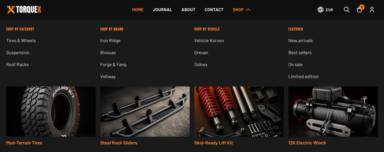
Header & navigation
The header is where shoppers find your brand, navigate your catalog, and reach search, cart, and their account. In Torquex it is built from the Header section, which sits in the header group at the top of the theme editor alongside the Announcement bar. The links inside your menus, however, are built in Online Store → Navigation, not in the editor — the Header section just points to a menu.
This page covers every header setting, how Torquex turns a menu into drop-downs and mega menus, how predictive search works, and the language/country entry points.

Where the header lives
Section titled “Where the header lives”In the theme editor, the Announcement and Header sections appear under the Header group (the first group in the left-hand section list, above the page content). Both are tagged to that group and cannot be moved into the page body. The Header renders on every page of your store, because Torquex’s layout includes the header group on all templates.
The default header group ships in this order:
- Announcement — the promo/shipping bar across the very top.
- Header — logo, navigation, search, cart, and account.
You can also add an app block to the Header section (it accepts @app blocks), and Torquex renders any app blocks in a dedicated row beneath the main header bar.
Header section settings
Section titled “Header section settings”Open the Header section in the editor to reach these. Settings are grouped under the headings shown.
Navigation
Section titled “Navigation”| Setting | What it does | Default |
|---|---|---|
| Main menu | Selects which navigation menu the header displays. Points to a menu you build in Online Store → Navigation. | main-menu (the menu Shopify creates for every store) |
The Header reads the menu you choose here and renders its top-level links as the horizontal nav on desktop and the slide-in drawer on mobile. You manage the links themselves in the admin — see Build the main menu.
Actions
Section titled “Actions”| Setting | What it does | Default |
|---|---|---|
| Show country / currency selector | Adds a globe button that opens a panel for choosing the shopper’s country/region (and its currency). | Off |
| Show language selector | Adds a language picker to the same panel. | Off |
| Show account link | Shows the account icon, linking to the customer account area (or the login page when accounts are disabled). | On |
Search
Section titled “Search”| Setting | What it does | Default |
|---|---|---|
| Enable search | Shows the search icon in the header, which opens a search panel. | On |
| Enable predictive search | Turns on live product/collection suggestions as the shopper types. Only available when Enable search is on. | On |
| Max suggestions | How many suggestions to request (range 3–10). Only shown when both search settings above are on. | 6 |
See Search & predictive search for how the panel behaves.
| Setting | What it does | Default |
|---|---|---|
| Enable cart | Shows the cart icon with a live item-count badge. | On |
The cart icon’s shape (bag, cart, or basket) is not set here — it comes from the global Cart icon option in Theme settings → Cart. The badge count updates automatically and hides when the cart is empty. Whether clicking it opens a slide-out drawer or the full cart page is also set globally by Cart type in Theme settings → Cart. See Cart & checkout.
Layout
Section titled “Layout”| Setting | What it does | Default |
|---|---|---|
| Color scheme | The color scheme applied to the header bar. | Scheme 1 |
| Stick to top on scroll | Pins the header to the top of the viewport so it stays visible as the shopper scrolls. | On |
The logo (automatic)
Section titled “The logo (automatic)”The header logo is not configured in the Header section — it is automatic. Torquex renders your store logo from the global Theme settings → Logo group: it picks Dark mode logo or Light mode logo based on the brightness of the header’s color scheme background (dark schemes use the dark-mode logo), sizes it with the global logo scale, and uses your logo alt text. If no logo image is uploaded, the header falls back to your store name as a styled text wordmark. The mobile drawer header uses the same logo.
To change the header logo, edit Theme settings → Logo, not the Header section. Full reference: Theme settings.
Header layout (automatic)
Section titled “Header layout (automatic)”The bar arrangement is built in and responsive — there is no alignment or layout-position control to set:
- Desktop (≥ 990px): logo on the left, navigation centered, and the action icons (search, cart, account, localization) on the right.
- Mobile (< 990px): a hamburger button on the left opens the navigation drawer; the logo and action icons remain in the bar.
The header width follows your global Page width (Theme settings → Layout). On mobile the navigation moves entirely into a slide-in drawer; the desktop horizontal nav is hidden.
Build the main menu
Section titled “Build the main menu”The links in your header are managed in your Shopify admin, not the theme editor. The Header section only points at the menu you select in its Main menu setting.
Open Navigation
Go to Online Store → Navigation.
Choose your menu
Open the Main menu (handle main-menu) — the menu the Header uses by default — or create a new menu and select it in the Header’s Main menu setting.
Add top-level links
Add your top-level links (collections, the all-products page, your blog, key pages, a “Shop by vehicle” landing collection, and so on).
Nest for drop-downs
Create drop-downs and mega menus by nesting links (drag a link beneath another). See the nesting rules below.
Your top-level menu is built. Next, see how nesting depth turns a menu into a simple drop-down or a full mega menu.
Changes you save in Navigation appear immediately in the theme editor and on Preview — no republish needed. The link to your current page is highlighted automatically.
How nesting becomes drop-downs and mega menus
Section titled “How nesting becomes drop-downs and mega menus”Torquex decides the drop-down style automatically from how deeply you nest links in a top-level item:
| Menu structure | What renders on desktop |
|---|---|
| Top-level link, no children | A plain nav link. |
| Top-level link with one level of children | A simple drop-down list beneath the link. |
| Top-level link where any child has its own children (two levels deep) | A full-width mega menu panel. Each second-level link becomes a column heading, and its children become the links inside that column. |
So to build a mega menu, nest links two levels deep under a top-level item. To build a simple drop-down, nest one level deep. A chevron icon appears on any top-level link that has children.
On mobile, both drop-downs and mega menus collapse into expandable accordion rows inside the navigation drawer, so the same menu works on every device with no extra setup.
Drop-down and mega-menu behavior (automatic)
Section titled “Drop-down and mega-menu behavior (automatic)”- On desktop, drop-downs and mega menus open on hover and on keyboard focus, and close on mouse-out,
Escape, or clicking outside. They are fully keyboard-navigable. - On touch devices, the first tap on a parent link opens its panel instead of following the link.
- A mega menu panel shows one column per second-level link you nest under the top-level item — there is no fixed column cap. When you add more columns than fit across the page width, the extra columns wrap onto additional rows rather than being dropped.
Mega menu promos (blocks)
Section titled “Mega menu promos (blocks)”You can add a promotional image card to the bottom of a mega-menu column using the Mega menu promo block on the Header section. Torquex’s default header already ships with four Mega menu promo blocks — one for each column of the default Shop mega menu — each with an empty image, so in most cases you edit these existing blocks rather than adding new ones (add more only if you build extra mega-menu columns). To add or edit one, open the Header section in the editor and fill in:
| Block setting | What it does |
|---|---|
| Promo image | The image shown as a clickable card under the column’s links. A 16:9 image is recommended. |
| Promo label | A short caption shown under the image. |
| Promo link | Where the promo card links to. The label/image become clickable when this is set. |
| Hide this promo | Leaves the matching column without a promo while keeping later promo slots in place. |
Promos attach to mega-menu columns by order: the 1st promo block fills the 1st column of the open mega menu, the 2nd fills the 2nd column, and so on. Use Hide this promo to skip a column without shifting the promos that follow it.
The Header supports up to 50 blocks total (mega-menu promos plus any app blocks).
Search & predictive search
Section titled “Search & predictive search”When Enable search is on, a search icon appears in the header. Clicking it opens a search panel with a query box that posts to your store’s search results page. The panel traps keyboard focus while open and closes on Escape or an outside click.
With Enable predictive search also on, Torquex shows live suggestions as the shopper types:
- Suggestions begin after two characters and are debounced briefly to avoid querying on every keystroke.
- Results cover products and collections, capped at your Max suggestions value (3–10).
- Each suggestion shows a thumbnail, title, and price where available; arrow keys,
Home/End, andEnternavigate and open suggestions; a screen-reader-friendly result count is announced. - Pressing Enter in the input (or submitting the form) goes to the full search results page for the typed query.
On the full results page, shoppers get filtering and sorting like a collection. See Collection & search pages.
If you turn Enable predictive search off but leave Enable search on, the panel still works as a standard search box that submits to the results page — it just won’t show live suggestions.
Country & language selectors
Section titled “Country & language selectors”When you enable Show country / currency selector or Show language selector in the Header’s Actions group, Torquex adds a globe button to the header (and matching pickers inside the mobile navigation drawer). Clicking the globe opens a small Shop preferences panel where shoppers choose:
- Country/region (with its currency shown), and/or
- Language.
These pickers use Shopify’s own localization, so the available countries and languages come from your Settings → Markets and Settings → Languages configuration. The selector is automatically hidden unless there is more than one option — enabling the setting alone does not create a button if your store only offers one country or one language. Changing a value submits immediately and reloads the storefront in the chosen country/language.
The footer also offers country and language selectors as blocks; see Footer. For setting up languages and right-to-left support, see Translations & internationalization.
Garage / fitment in the header
Section titled “Garage / fitment in the header”Torquex’s vehicle garage and Year/Make/Model fitment selector are not built into the header as a dedicated control — there is no garage button setting on the Header section. The garage entry point lives in the Garage banner section (on the homepage by default), and the Year/Make/Model fitment selector appears on product pages once a product carries the custom.fitment metafield. On collection pages, only the “Fits your vehicle” badge surfaces (on product cards whose products have fitment data) — the selector itself does not.
If you want a header path to vehicle shopping, add a normal menu link in Online Store → Navigation — for example a “Shop by vehicle” top-level item (the default header config includes a vehicle-themed mega-menu column for exactly this) pointing at a landing collection or page. For the fitment data model and the garage feature, see Automotive features and the Metafields reference.
The announcement bar
Section titled “The announcement bar”The Announcement section — the slim promo/shipping bar above the header — is documented on its own page. See Announcement bar for every setting, including its text, link, mobile visibility, dismiss toggle, color scheme, and height.
What’s configurable vs. automatic
Section titled “What’s configurable vs. automatic”| Configurable | Automatic |
|---|---|
| Main menu choice; menu links and nesting (in Navigation); mega-menu promo blocks; sticky on/off; header color scheme; toggles for search, predictive search, max suggestions, cart, account link, country and language selectors; all announcement-bar fields. | Logo source and light/dark choice and the no-logo text fallback (driven by Theme settings → Logo); cart icon shape and cart drawer-vs-page (driven by Theme settings → Cart); cart count badge; drop-down vs. mega-menu rendering (from menu nesting depth); responsive desktop/mobile layout and the mobile drawer; hover/focus/keyboard open-and-close behavior; hiding the localization selector when only one option exists; predictive-search querying, debouncing, and keyboard navigation. |
Accessibility & internationalization
Section titled “Accessibility & internationalization”The header is keyboard-operable end to end: menus, the search panel, the localization panel, and the mobile drawer all manage focus, support Escape to close, and use ARIA states. Torquex meets WCAG 2.1 AA and supports right-to-left languages — the header, drawer, and drop-downs mirror correctly in RTL locales. No third-party app is required for any header feature.
Related: Announcement bar · Footer · Collection & search pages · Theme settings · Torquex support replies within 12 hours.