Collection & search pages
This page covers the three browsing experiences in Torquex: the collection template (a grid or list of products with filtering and sorting), the all-collections page (a grid of your collections), and the search results page. It also documents the product card used across all of them and the fitment badge that highlights parts matching a shopper’s saved vehicle.
A key distinction runs through this page: layout, density, and which controls appear are theme settings you set in the theme editor, while the actual filters (which product attributes shoppers can filter by, and how) are configured in Shopify admin under Search & Discovery. The theme renders whatever filters that app produces.
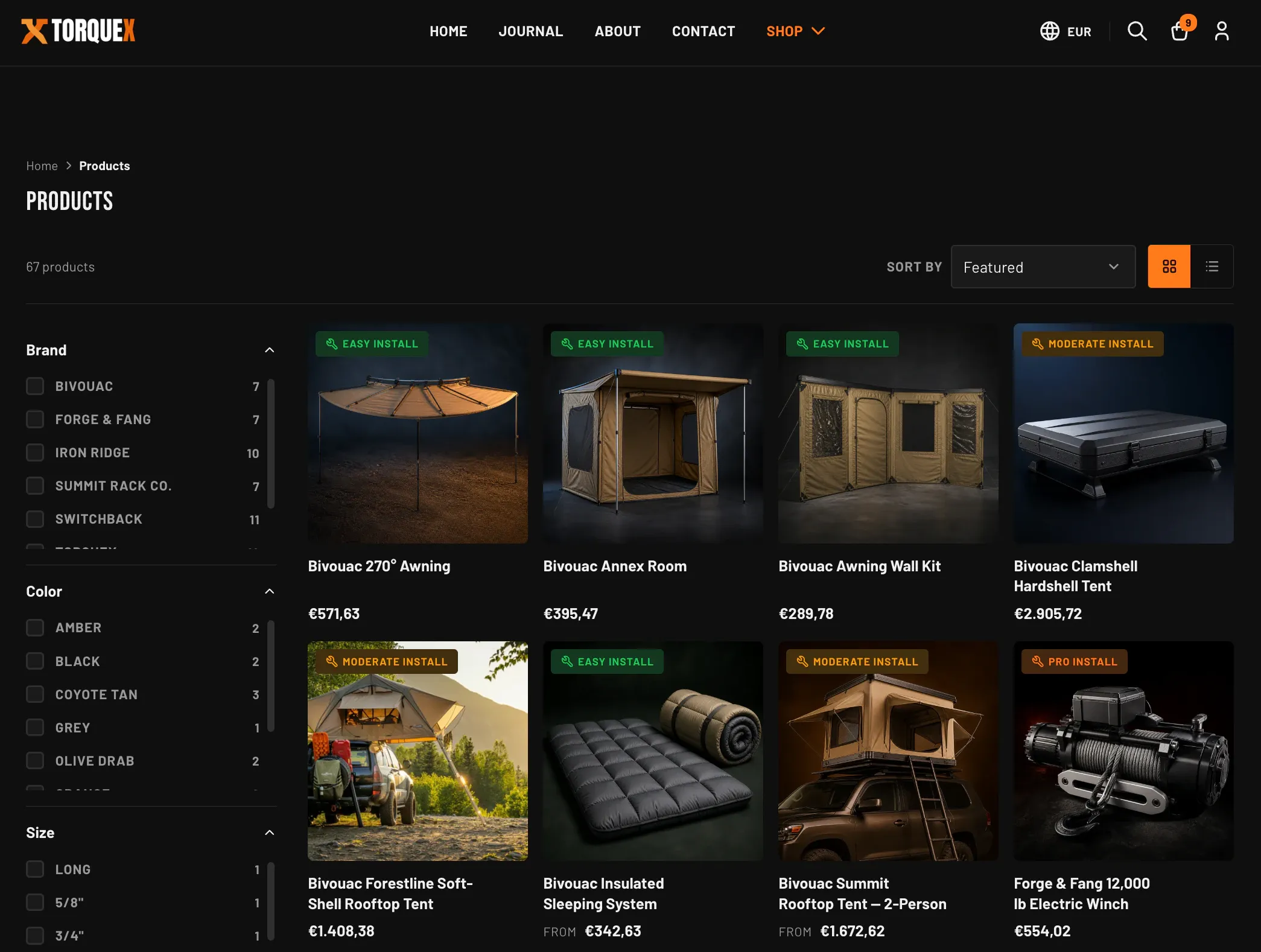
The collection template
Section titled “The collection template”Every collection page uses the Collection page section. It is the main section of the collection template, so it always renders on a collection URL — you configure it, you do not add or remove it.
To edit it: in the theme editor, open a collection page (use the top page picker to navigate to a collection), select the Collection page section, and adjust its settings. The settings are grouped under four headings.
Products and sort
Section titled “Products and sort”| Setting | What it does | Default |
|---|---|---|
| Products per page | How many products show before pagination. Range 12–48 in steps of 12. | 24 |
| Default sort | The sort order used when a shopper has not chosen one. Options: Featured, Best selling, Price: low to high, Price: high to low, Date: new to old, Date: old to new, Alphabetically: A-Z, Alphabetically: Z-A. | Featured |
Featured (the manual sort) respects the manual product order you set on the collection in Shopify admin. A shopper can still re-sort from the Sort by menu on the page; Default sort only sets the starting order.
Filtering
Section titled “Filtering”| Setting | What it does | Default |
|---|---|---|
| Enable filtering | Shows the filter panel and active-filter pills. Filters only appear when the collection actually has filters defined (see Filtering below). | On |
| Enable sorting | Shows the Sort by dropdown in the toolbar. | On |
| Show product count | Shows the result count (for example, “24 products”) above the grid. | On |
Layout
Section titled “Layout”| Setting | What it does | Default |
|---|---|---|
| Default view | Whether the grid loads in Grid or List mode. Each shopper can switch with the grid/list toggle, and their choice is remembered in their browser. | Grid |
| Columns (desktop) | Products per row on desktop. Range 2–5. (Tablet is fixed at 3 columns.) | 4 |
| Columns (mobile) | Products per row on mobile: 1 or 2. | 2 |
Section padding
Section titled “Section padding”| Setting | What it does | Default |
|---|---|---|
| Top padding | Space above the section, 0–120px. | 80 |
| Bottom padding | Space below the section, 0–120px. | 80 |
Liquid and app blocks
Section titled “Liquid and app blocks”The Collection page section accepts Custom Liquid blocks and app blocks. Use these to drop a banner, a promotional message, or an app’s content directly into the collection page between the header and the product grid.
Grid and list view
Section titled “Grid and list view”The toolbar above the grid includes a two-button Grid / List toggle:
- Grid view shows products as cards in the column count you set.
- List view shows one product per row — image on one side, details on the other — and, on tablet screens and wider, reveals a short product description excerpt under the title.
The toggle works without a page reload, and the chosen layout is remembered for that shopper. If a shopper has JavaScript disabled, the page still renders fully in your Default view with working filters, sorting, and pagination — in that case the filters render inline in the page (not behind the mobile Filters button, which is a JavaScript enhancement).
The toolbar, sorting, and pagination
Section titled “The toolbar, sorting, and pagination”When the collection has products (or active filters), a toolbar sits above the grid containing the product count, the filter button, the Sort by menu, and the view toggle.
- Sorting uses the standard Shopify sort options. Changing the Sort by menu re-sorts immediately. With JavaScript disabled, an Apply button next to the menu submits the choice.
- Pagination is numbered: previous/next links plus page numbers appear below the grid once there is more than one page. The number of products per page comes from the Products per page setting. (Torquex uses classic numbered pagination, not infinite scroll or a load-more button.)
- Empty states are handled for you. If filters return nothing, the page shows a “no results” message with a Clear all button. If the collection itself is empty, it shows a message with a button to browse all products.
Filtering (Search & Discovery)
Section titled “Filtering (Search & Discovery)”Torquex renders filters, but it does not define them. Which filters appear, and what they filter by, is controlled entirely in Shopify admin.
To set up filters:
- Install the free Search & Discovery app from Shopify (it is published by Shopify, not a third party that the theme depends on).
- In Shopify admin go to Settings → Search & Discovery → Filters.
- Add the filters you want — for example product type, vendor, price, availability, or any product option or metafield you have enabled for filtering.
Once filters exist on a collection and Enable filtering is on, the theme automatically displays them. On desktop, filters sit in a sticky sidebar beside the grid. On mobile, a Filters button opens them in a slide-in panel. The theme supports:
- Checkbox lists for standard filters, each showing the matching product count.
- Swatch filters (color or image swatches) when a filter is configured with swatch presentation in Search & Discovery.
- Price range filters with from/to inputs.
- Active-filter pills above the grid that a shopper can tap to remove a single filter, plus a Clear all link to remove them all.
The product card
Section titled “The product card”Every product in a collection grid, in list view, and in search results is rendered by the same product card. Its appearance is controlled by global product settings, not by the collection section, so a change applies everywhere a card is shown.
Set these under Theme settings → Products:
| Setting | What it does | Default |
|---|---|---|
| Show vendor | Shows the product vendor/brand above the title. | Off |
| Show install difficulty badge | Shows the install-difficulty badge on the card image when the product has a custom.install_difficulty value. | On |
| Show sale badge | Shows a sale badge when a product has a compare-at price higher than its price. | On |
| Sale badge style | How the sale badge reads: Percentage off, Label (“Sale”), or Both. | Percentage off |
| Show sold-out badge | Shows a “Sold out” badge on unavailable products. | On |
| Image aspect ratio | The card image shape across all cards: Square, Portrait, or Landscape. | Square |
| Show second image on hover | On hover, swaps the card image to the product’s second image (when one exists). | On |
| Enable quick view | Adds a Quick view button to each card that opens the product in a popup without leaving the collection. | On |
The card itself always shows the product image, title, and price. The install-difficulty badge (a wrench icon with “Easy install”, “Moderate install”, or “Pro install”) appears only when the product carries a valid custom.install_difficulty value and Show install difficulty badge is on. Only one of sold-out / sale badges shows at a time — a sold-out product never also shows a sale badge.
For the full list of global product settings, see Product cards. For the metafields that drive badges and specs, see Metafields reference.
The “Fits your vehicle” badge on cards
Section titled “The “Fits your vehicle” badge on cards”Each product card can show a “Fits your [vehicle]” badge. This badge appears on a card only when both are true:
- The product has a
custom.fitmentmetafield listing the vehicles it fits, and - The shopper has saved a vehicle (via the fitment selector), and that saved vehicle matches one of the product’s fitment entries.
The badge is filled in the shopper’s browser from their saved vehicle, so it updates per visitor without any per-collection setting. Products without custom.fitment simply never show it. The format and the metafield shape are documented in Automotive features and Metafields reference.
Filtering by vehicle on collections
Section titled “Filtering by vehicle on collections”Torquex has two distinct vehicle-fit features. It is worth being precise about which is which:
- The fitment selector (Year → Make → Model dropdowns) lives on the product page, not on collection pages. It reads a single product’s
custom.fitmentmetafield and tells the shopper whether that part fits the vehicle they choose, saving the vehicle to their browser. This is covered in Product pages and Automotive features. - Collection-level filtering by vehicle is done with Search & Discovery filters, exactly like any other filter (see Filtering). To let shoppers narrow a collection to parts for a given vehicle, expose the relevant vehicle attributes (for example make, model, or fitment data stored on the product) as filters in Search & Discovery. The collection page then lists them in the filter panel.
In other words: the on-product fitment selector confirms fit for one part, while collection filtering uses Shopify’s filtering system to narrow many parts at once. The product cards in a filtered collection still show the “Fits your vehicle” badge for the shopper’s saved vehicle, so the two features reinforce each other.
The all-collections page
Section titled “The all-collections page”The all-collections page (the storefront’s “list of collections”, at /collections) uses the Collections list section. It renders each of your collections as a linked card with its image and, optionally, a product count.
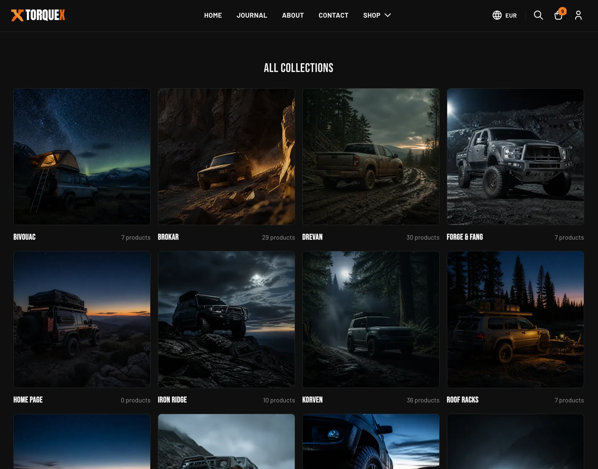
To edit it, open the Collections list page in the theme editor and select the section. Its settings:
Content
| Setting | What it does | Default |
|---|---|---|
| Heading | The page heading shown above the grid. Leave blank to hide it. | All collections |
| Show product count | Shows the number of products in each collection on its card. | On |
Layout
| Setting | What it does | Default |
|---|---|---|
| Color scheme | The color scheme applied to this section. | Scheme 1 |
| Image aspect ratio | Collection card image shape: Square, Portrait, or Landscape. | Square |
| Columns (desktop) | Collections per row on desktop. Range 2–4. (Mobile is 1, tablet is 2.) | 4 |
| Collections per page | How many collections show before pagination. Range 12–48. | 16 |
Section padding offers the same Top padding (default 64) and Bottom padding (default 96) controls, 0–120px.
Each collection card uses the collection’s own image. If a collection has no image set, the card falls back to the featured image of its first product, and if there is none, a placeholder graphic. The Collections list section also accepts Custom Liquid and app blocks below the grid.
The search results page
Section titled “The search results page”The search results page uses the Search results section. It renders a search box at the top and, after a search, a grid of matching results. Results can include products, blog articles, and pages — products use the same product card described above; articles and pages use a compact result card labeled Article or Page.
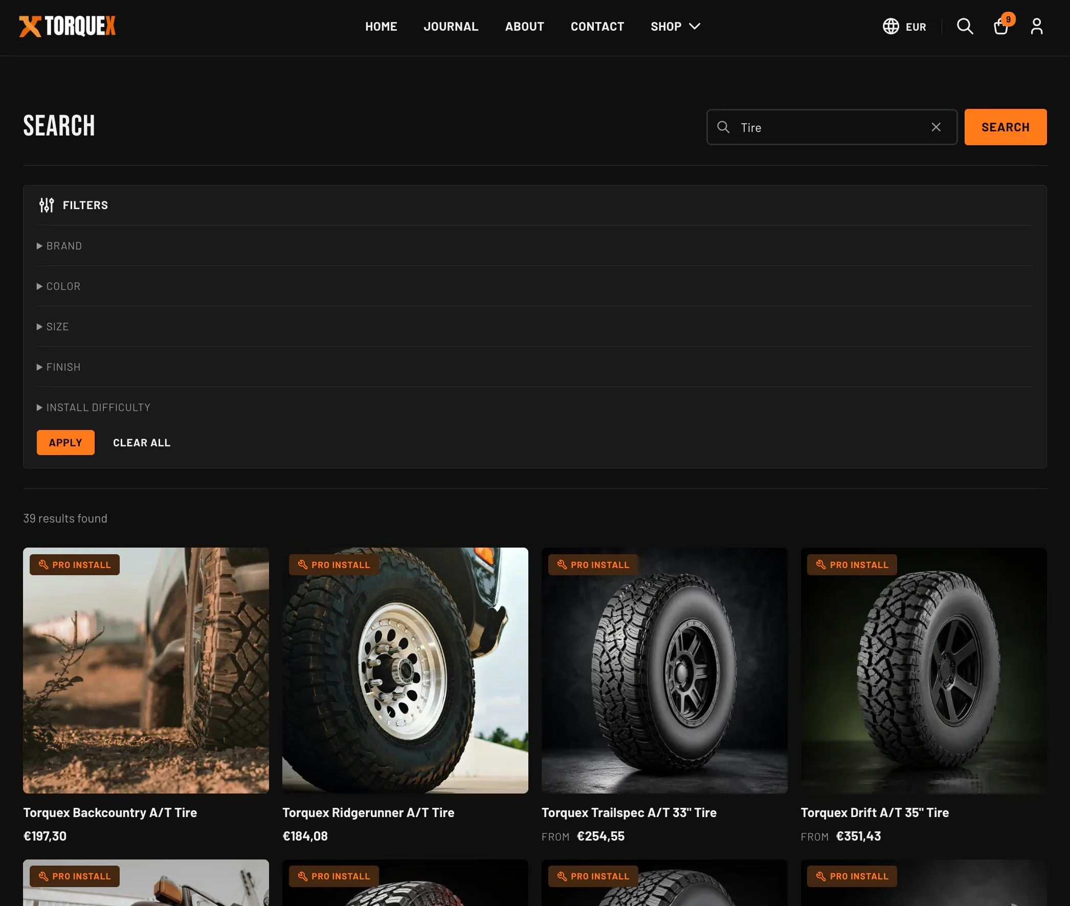
Open the Search template in the theme editor and select the Search results section to configure it.
Results
| Setting | What it does | Default |
|---|---|---|
| Show filters | Shows a collapsible filter panel on the results page (uses the same Search & Discovery filters as collections). | On |
| Products per page | Results per page before pagination. Range 12–48 in steps of 12. | 24 |
Layout
| Setting | What it does | Default |
|---|---|---|
| Color scheme | The color scheme applied to the search page. | Scheme 1 |
| Columns (desktop) | Results per row on desktop. Range 2–5. | 4 |
| Columns (mobile) | Results per row on mobile: 1 or 2. | 2 |
Section padding offers the same Top padding (default 64) and Bottom padding (default 96) controls, 0–120px. The Search results section also accepts Custom Liquid and app blocks.
The search box, result count, active-filter chips, and pagination behave like their collection counterparts. The page has three states handled for you:
- Before searching — an empty prompt with a button to browse all products.
- No matches — a “No matches found” message, a hint to try different keywords, a Clear all button (when filters are active), and a button to browse all products.
- Results found — the result count, any active-filter chips, and the paginated results grid.
What’s a theme setting vs an admin setting
Section titled “What’s a theme setting vs an admin setting”Use this summary to keep the two systems straight:
| You control in the theme editor | You control in Shopify admin |
|---|---|
| Grid vs list, columns per row, products per page | Which filters exist and what they filter by (Search & Discovery) |
| Default sort order and whether sorting/filtering UI shows | The collections, their products, images, and manual order |
| Product card image ratio, badges, hover image, quick view | Product metafields (custom.fitment, custom.install_difficulty, etc.) |
| Whether search shows filters; result columns and count | Search relevance, synonyms, and suggestions (Search & Discovery) |
Next: Product pages · Related: Automotive features, Metafields reference · Need a hand? Torquex support.