Product pages
The product page is the most configurable template in Torquex. It is built from a Product section (the media gallery plus a stack of rearrangeable blocks), a Product tabs section for long-form content, and three optional supporting sections — Product recommendations, Recently viewed, and the Sticky add-to-cart bar. Everything is assembled in the theme editor: open Online Store → Themes → Customize, then select a product from the page selector to edit the Products → Default product template.
Every block and section here is built with vanilla CSS and JavaScript. No third-party apps are required for any built-in feature (a reviews app is the only optional integration). Variant changes, pricing, stock, the gallery, the lightbox, the sticky bar, and recommendations all update live in the browser.
The product template
Section titled “The product template”Torquex ships a product template that lays out, in order:
- Product section — gallery on one side, the product blocks on the other.
- Product tabs section — collapsible accordions / desktop tabs.
- Product recommendations section — “You may also like”.
- Recently viewed section.
- Sticky add-to-cart bar section.
You can reorder, remove, or duplicate these sections, and you can apply the template to specific products by creating alternate templates in your Shopify admin under Online Store → Themes → ⋯ → Edit code → Templates, or via Products → (a product) → Theme template.
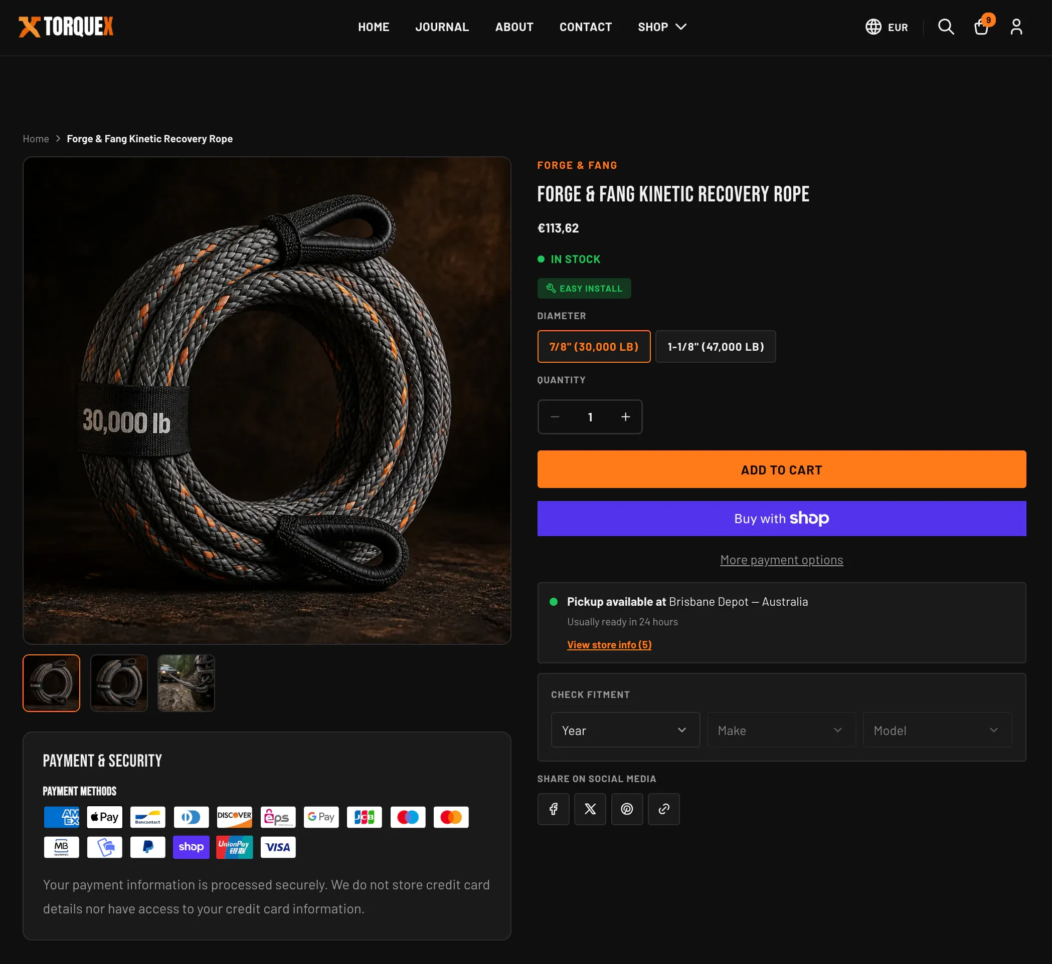
The Product section and its layout
Section titled “The Product section and its layout”The Product section holds the media gallery and a panel of blocks. On desktop the gallery and the block panel sit side by side, and the block panel becomes sticky as the shopper scrolls. On mobile they stack.
Find these in the section’s settings when the Product section is selected in the theme editor:
| Setting | What it does | Default |
|---|---|---|
| Enable image lightbox | Opens a full-screen image view when the gallery image is clicked. | On |
| Enable image zoom | Turns on the hover magnifier (desktop pointers only). | On |
| Zoom method | Hover lens (loupe) shows a circular magnifier that follows the cursor; Hover inner zoom magnifies inside the image frame. Only visible while Enable image zoom is on. | Hover lens (loupe) |
| Show payment and security | Shows the trust panel below the gallery. | On |
| Heading | The trust panel heading text. | Payment & Security |
| Show payment icons | Shows icons for the payment providers enabled in your checkout settings. | On |
| Payment methods label | Sub-heading above the payment icons. | Payment methods |
| Security text | Rich-text reassurance message in the trust panel. | A default privacy statement |
| Padding top / Padding bottom | Vertical spacing around the section (0–120px). | 80 / 80 |
The product title and price are blocks you place in the panel (see below), while breadcrumbs and JSON-LD structured data are output by the section itself — so each product page emits valid schema.org Product markup (name, image, brand, SKU, price, availability) for search engines. The SKU in that markup uses the custom.part_number metafield when set.
The media gallery
Section titled “The media gallery”The gallery renders every media item attached to the product — images, Shopify-hosted video, external video (YouTube/Vimeo), and 3D models.
- Main stage shows the active media. Previous/next arrows appear when there is more than one item.
- Thumbnail strip lets shoppers jump to any item; video and 3D items carry a small play / zoom icon. The strip scrolls horizontally with its own prev/next controls when it overflows.
- Video plays inline with native controls. 3D models load Shopify’s model viewer and a View in your space (AR) button on supported devices.
- The gallery is keyboard-navigable and respects the visitor’s reduced-motion preference.
Lightbox
Section titled “Lightbox”When Enable image lightbox is on, clicking a gallery image opens a full-screen dialog with its own previous/next navigation, a close button, and a live region that announces the current slide for screen readers. The lightbox only includes image media. It is fully keyboard- and RTL-aware.
Hover zoom
Section titled “Hover zoom”When Enable image zoom is on (desktop pointers only), hovering the main image magnifies it. Zoom method controls the style: a circular loupe that tracks the cursor, or an inner zoom that enlarges within the image frame. Lightbox and hover zoom can both be on at once.
Product blocks
Section titled “Product blocks”Inside the Product section, add, remove, reorder, and configure these blocks in the theme editor. The default order is vendor, title, SKU, price, stock, badges, variant picker, quantity, buy buttons, pickup, fitment, share — but you control it.
The variant picker, quantity selector, and buy buttons are separate blocks that are wired together automatically: the picker and quantity inputs submit through the buy-buttons form even though they sit in different blocks. You can place them in any order.
You can also add general-purpose blocks: Sales point, Custom text, Custom Liquid, and app blocks.
Product vendor
Section titled “Product vendor”Shows the product’s vendor/brand, styled as a small accent-colored eyebrow. Renders nothing if the product has no vendor. No settings.
Product title
Section titled “Product title”Renders the product name. On the product template it is the page’s single <h1>. No settings.
Product SKU
Section titled “Product SKU”Shows the product’s SKU or part number. It prefers the custom.part_number metafield and falls back to the selected variant’s Shopify SKU; it updates as the shopper changes variants. Renders nothing when neither is set. No settings. See the SKU/part-number metafield on the Automotive features page.
Product price
Section titled “Product price”Shows the current price. It adds a struck-through compare-at price when the product is on sale, a per-unit price for unit-priced products (e.g. price per 100 ml), and a “tax included” note when your store displays tax-inclusive prices. Updates live on variant change. No settings.
Product stock indicator
Section titled “Product stock indicator”A colored dot plus label that reflects the selected variant’s inventory:
- In stock (success color) when available.
- Low stock (warning color) when tracked inventory is at or below 5 units, with the remaining count.
- Sold out (error color) when unavailable.
It only shows low/sold-out states for variants that track inventory and deny overselling; otherwise it shows “in stock”. Updates live on variant change.
| Setting | What it does | Default |
|---|---|---|
| Hide when stock is abundant | Only show the indicator when stock is low or sold out — hides the plain “in stock” message. | Off |
Product badges
Section titled “Product badges”Shows two automotive badges side by side, each only when its metafield is present:
- The install-difficulty badge (a wrench icon plus Easy install / Moderate install / Pro install), from
custom.install_difficulty. - The “Fits your vehicle” badge, which lights up when the shopper’s saved garage vehicle matches the product’s
custom.fitmentdata.
This block has no settings — it reads its data from metafields. See Automotive features for how to set up custom.install_difficulty and custom.fitment.
Variant picker
Section titled “Variant picker”Renders each product option. It renders nothing for products that have only a single (default) variant.
| Setting | What it does | Default |
|---|---|---|
| Show variant labels | Show the option name (e.g. “Color”) above each option. | On |
| Type | Buttons renders selectable chips (with color/image swatches when your options use Shopify swatches); Dropdown renders a native select per option. | Buttons |
| Enable dynamic product options | For combined listings, updates option availability across connected products without a full page reload. Leave off for standard single-product variants. | Off |
Unavailable option values are shown struck-through (buttons) or labeled unavailable (dropdown) rather than hidden, so shoppers can see the full range.
Quantity selector
Section titled “Quantity selector”A labeled stepper with minus/plus buttons. It honors each variant’s quantity rules — minimum, maximum, and increment — and caps the maximum at available stock for inventory-tracked variants. It is disabled when the variant is sold out. No settings.
Buy buttons
Section titled “Buy buttons”The core purchase form. It contains:
- The Add to cart button (becomes “Sold out” and disables when the variant is unavailable).
- Purchase options (one-time vs. subscription) when the product has selling plans.
- A gift card recipient form (email, name, message, send-on date) when the product is a gift card.
- The Shop Pay Installments banner, when enabled.
| Setting | What it does | Default |
|---|---|---|
| Show dynamic checkout button | Adds express wallet buttons (Shop Pay, PayPal, and others) for instant checkout. Requires accelerated checkout to be enabled in Theme settings → Checkout. | On |
Product description
Section titled “Product description”Renders the product’s description as rich text, with an optional Read more / Show less toggle.
| Setting | What it does | Default |
|---|---|---|
| Truncate after lines | Collapse the description after this many lines and show a “Read more” toggle. Set to 0 to always show the full text. | 3 |
The description also appears in the Tab — Description tab; use whichever placement suits your layout, or both.
Pickup availability
Section titled “Pickup availability”Shows local pickup availability for the selected variant at your store’s locations, with a “View store info (N)” button (labeled “Store pickup availability” for screen readers) that opens a drawer listing each location and its pickup status. It only appears when local pickup is set up in your Shopify admin and at least one location offers it. Updates on variant change. No settings.
Fitment checklist
Section titled “Fitment checklist”Renders the cascading Year → Make → Model fitment selector for the current product, telling the shopper whether the part fits their vehicle. It appears only when the product has custom.fitment data. No settings — see Automotive features for the fitment metafield format and behavior.
Share on social media
Section titled “Share on social media”Adds share buttons for the current product.
| Setting | What it does | Default |
|---|---|---|
| Heading | Optional eyebrow above the buttons. Leave blank to hide it. | Share on social media |
| Show the Facebook share button. | On | |
| X (Twitter) | Show the X share button. | On |
| Show the Pinterest share button. | On | |
| Copy link | Show a button that copies the product URL to the clipboard. | On |
| Show button labels | Show text labels next to the icons (off = icon-only compact buttons). | Off |
The block hides itself if every network is turned off.
Product tabs
Section titled “Product tabs”The Product tabs section holds long-form product content. On mobile each tab is a collapsible accordion; on wide screens the tabs render as a horizontal tab bar (one panel open at a time). The section only renders when it has at least one tab block. Add, remove, and reorder the tab blocks in the theme editor.
Find these in the section’s settings:
| Setting | What it does | Default |
|---|---|---|
| Color scheme | The color scheme applied to the tabs section. | scheme-1 |
| Padding top / Padding bottom | Vertical spacing around the section (0–120px). | 80 / 80 |
Each tab shows an “empty” message when it has no content to display, so reviewers and merchants can see the structure even before data is added.
Tab — Description
Section titled “Tab — Description”Renders the full product description as rich text. No settings.
Tab — Specifications
Section titled “Tab — Specifications”Renders a technical specs table built from product metafields: Part number (custom.part_number), Weight (custom.weight_kg, with ” kg” appended automatically), Dimensions (custom.dimensions), Material (custom.material), and Warranty (custom.warranty). The tab shows only the rows that have values. No settings — see Automotive features for the exact metafield setup and value formats.
Tab — Fitment
Section titled “Tab — Fitment”Renders a full vehicle-fitment table from the custom.fitment metafield, with Year, Make, Model, and Trim columns (Trim falls back to an em dash when a row has none). No settings — see Automotive features for the fitment JSON format.
Tab — Installation
Section titled “Tab — Installation”Installation guidance with up to three parts: the install-difficulty badge (from custom.install_difficulty), rich-text instructions, and an optional video.
| Setting | What it does | Default |
|---|---|---|
| Installation instructions | Rich-text installation steps. | Empty |
| Video (Shopify-hosted) | A Shopify-hosted video. Preferred — overrides the video URL below when set. | Empty |
| Video URL (YouTube / Vimeo) | A YouTube or Vimeo link, used only when no Shopify-hosted video is set. | Empty |
The difficulty badge is read from the product metafield; see Automotive features.
Tab — Reviews
Section titled “Tab — Reviews”Hosts a review app’s block. Add your review app block to this tab in the theme editor. On the storefront the tab stays hidden until a review app block is present; before then, guidance shows only in the theme editor. The tab works with any Shopify review app that provides theme app blocks — no specific app is required.
Sticky add-to-cart bar
Section titled “Sticky add-to-cart bar”The Sticky add-to-cart bar section pins a compact purchase bar to the bottom of the screen after the shopper scrolls past the main add-to-cart button. It shows the product thumbnail, title, price, a variant selector (for multi-variant products), and an Add to cart button. It stays in sync with the main variant picker — changing the variant in either place updates both, including the price and availability.
| Setting | What it does | Default |
|---|---|---|
| Show bar after scrolling | How far down the page (200–800px) a visitor scrolls before the bar appears. | 400 |
| Hide on mobile | Don’t show the sticky bar on phone-sized screens. | On |
The bar only renders on the product template.
Quick view
Section titled “Quick view”Quick view lets shoppers preview a product in a modal directly from a product card, without leaving the collection or search page. It shows the featured image, title, price, a short description, variant dropdowns, a quantity stepper, an Add to cart button, and a “View full details” link.
Quick view is enabled globally — turn it on with Enable quick view under Theme settings → Products (it applies to product cards across collection, search, and recommendation grids). There are no per-page settings for the quick-view modal itself.
Product recommendations
Section titled “Product recommendations”The Product recommendations section shows a grid of related or complementary products under the main product. It loads asynchronously from Shopify’s recommendations API and hides itself if there are none to show.
| Setting | What it does | Default |
|---|---|---|
| Heading | Section heading (e.g. “You may also like”). Leave blank to hide it. | You may also like |
| Recommendation type | Related products are chosen automatically by Shopify; Complementary products are the ones you set per product in the Search & Discovery app. | Related products |
| Maximum products | How many products to show (2–10). | 4 |
| Color scheme | The color scheme for the section. | scheme-1 |
| Columns (desktop) | Columns on desktop (2–5). | 4 |
| Columns (mobile) | Columns on phones (1 or 2). | 2 |
| Padding top / Padding bottom | Vertical spacing (0–120px). | 80 / 80 |
Recently viewed
Section titled “Recently viewed”The Recently viewed section shows products the shopper has looked at, read from their browser (no account or app needed). When there is no history yet, it can fall back to a collection you choose.
| Setting | What it does | Default |
|---|---|---|
| Heading | Section heading. Leave blank to hide it. | Recently viewed |
| Fallback collection | Products shown when the visitor has no browsing history yet. | None |
| Color scheme | The color scheme for the section. | scheme-1 |
| Columns (desktop) | Columns on desktop (2–6). | 4 |
| Columns (mobile) | Columns on phones (1 or 2). | 2 |
| Maximum products | How many products to show (4–10). | 4 |
| Padding top / Padding bottom | Vertical spacing (0–120px). | 80 / 80 |
If there is no history and no fallback collection, the section hides itself.
Accessibility and internationalization
Section titled “Accessibility and internationalization”All product blocks, the gallery, the lightbox, the tabs, and the sticky bar use semantic markup, accessible labels, live regions for price/stock/availability announcements, full keyboard support, and respect reduced-motion preferences — meeting WCAG 2.1 AA. Every label is translatable, and the layout is fully RTL-aware.
Next: set up the data behind the automotive blocks in Automotive features, or review the global product-card options in Collection & search pages. Need a hand? Contact Torquex support — we reply within 12 hours.