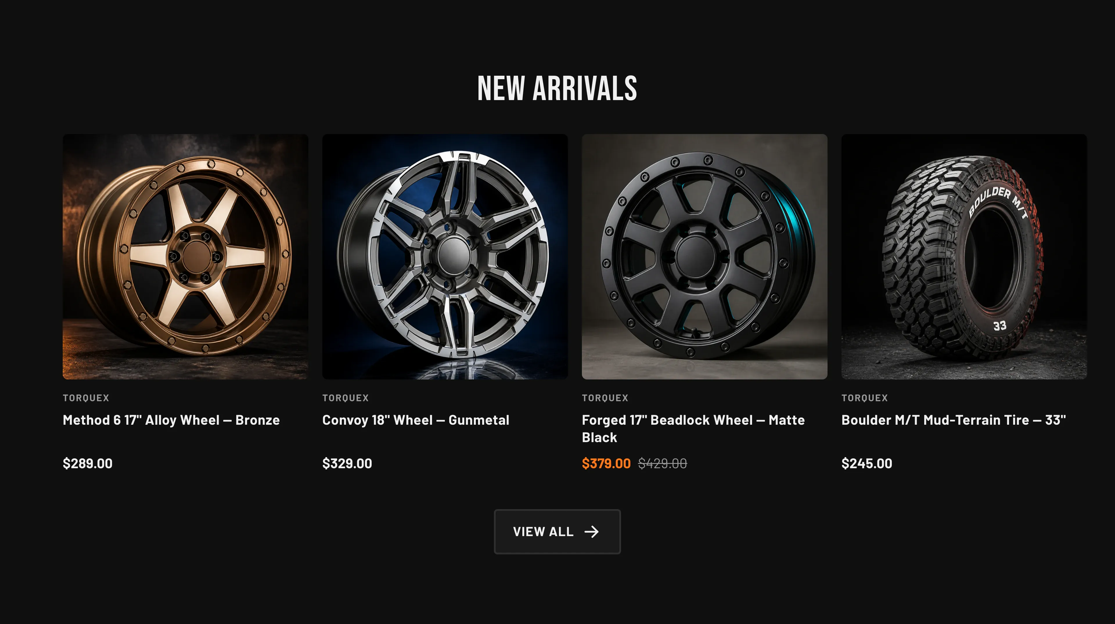
Featured products
A grid of product cards pulled automatically from one collection — ideal for “New arrivals” or “Best sellers”. Unlike Featured collections, you don’t add cards by hand; the section reads products from the collection you choose.
Key settings (in the section’s settings):
| Setting | What it does | Default |
|---|---|---|
| Heading | Section title. | ”New arrivals” |
| Collection | The source collection. | — |
| Products to show | How many products to display, 2–10. | 4 |
| Show “View all” link | Adds a link to the full collection. | On |
| Columns (desktop) | 2–5 columns. | 4 |
| Columns (mobile) | 1 or 2 columns on phones. | 2 |
| Color scheme | Section colors. | scheme-1 |
| Top padding / Bottom padding | Vertical spacing around the section (0–120 px). | 80 px each |
Blocks: none — products and their cards come from the chosen collection. Card details (vendor, badges, image ratio, hover image, quick view) follow your global Theme settings → Products options; see Product cards and Collection & search pages.
When to use it: Surface a live, auto-updating set of products without curating individual cards — point it at a “New arrivals” or “Featured” collection and it stays current.
Related: Featured collections · Featured product · Torquex support replies within 12 hours.