Footer
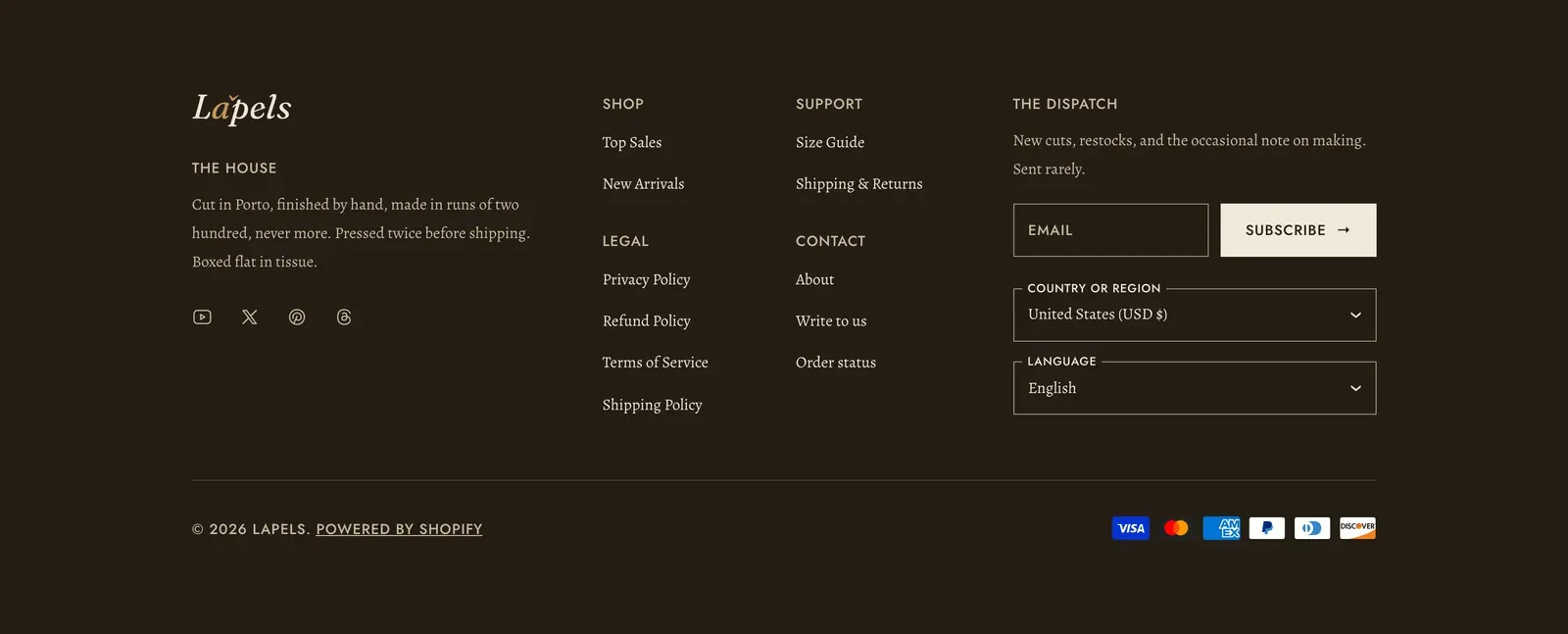
The footer is the band at the foot of every page. In Lapels it is one Footer section: three columns you fill with blocks, a hairline, and a base bar carrying the copyright line and your payment marks.
What it does: Files everything a shopper looks for after the page has finished. The mark, what the house is, where to write, what you promise, and how to keep in touch.
The shape is fixed, so it reads the same on every template. What stands inside it is yours.
Where the footer lives
Section titled “Where the footer lives”The footer belongs to the Footer section group, so it renders on every page automatically. You never add it template by template. Open Online Store → Themes → Customize, find the Footer group in the left-hand sidebar, and select the Footer section inside it.
The header sits in its own group the same way, and the cart drawer, search drawer, and quick view sit in a third. See Header and Cart drawer.
Set up the footer
Section titled “Set up the footer”Open the Footer section
Go to Online Store → Themes → Customize, expand the Footer group, and select Footer. You will see three columns. They are fixed, so you cannot add, remove or reorder them. Everything inside each one is yours.
Fill the first column
Click Add block inside the first column and add a Logo or a Wordmark, then a Text block for a short line about the house, then Social media. This is the shape Lapels ships with.
Add a menu to the second
In the second column add a Footer menu block and point it at a menu you built in Content → Menus. Nest links under a parent and Lapels renders each parent as a group heading with its destinations underneath.
Add the newsletter and pickers
In the third column add a Newsletter block, and a Country and language block if your store sells across markets or publishes more than one language.
Set the color scheme and spacing
Back in the section’s own settings, pick a Color scheme, decide whether the payment icons show, and set the space above and below the footer under Section spacing.
The footer is built. Drag blocks within a column to reorder them, and drag them between columns to rebalance.
Footer settings
Section titled “Footer settings”Select the Footer section in the editor.
| Setting | What it does | Default |
|---|---|---|
| Color scheme | The ground and ink for the whole footer, including its columns and base bar. | scheme-night |
| Show the payment icons | Shows the marks for the payment methods your store accepts, in the base bar. | On |
Section spacing: pick Device (Desktop or Mobile), then set Top and Bottom in pixels, 0–200. Desktop and mobile keep separate values. Defaults are 96 px on desktop and 56 px on mobile.
The blocks you can add to a column
Section titled “The blocks you can add to a column”Click Add block inside any column. A column takes any mix of these, in any order, and you can put the same type in more than one column.
Wordmark
Section titled “Wordmark”Your store’s name set in the theme’s own type, with an optional tagline underneath.
- Wordmark. The name itself. Leave it blank and it falls back to the wordmark under Theme settings → Brand, then to your store name.
- Show the tagline. On by default.
- Tagline. The short line under the name. Blank falls back to the tagline under Theme settings → Brand, then to your Shopify brand slogan.
Your mark, as an image.
- Logo. Leave it blank and the footer uses your Default logo, or your Inverse logo when the footer’s color scheme is dark, then your wordmark when neither is set. Choose a file here only when you want a different mark in the footer.
- Size. Small, Medium, or Large. Medium by default.
Wordmark and Logo are ordinary blocks, not furniture, so the mark can open a column, close one, or be left out entirely.
Footer menu
Section titled “Footer menu”A titled list of links from one of your navigation menus.
- Heading. The column title, “Shop” by default. Leave it blank and the menu’s own group headings take that level instead, which is how Lapels’ shipped footer is set.
- Footer menu. The menu to render. Use any menu from Content → Menus. The default is your store’s Footer menu.
Unlike the header, this block publishes sub-items: a menu item with children becomes a group heading with its destinations listed underneath, so a footer menu can file a whole directory. A parent parked on # is rendered as plain type rather than as a dead link.
A short passage of prose.
- Heading. “The house” by default.
- Text. Rich text. Lapels ships a line about how the clothes are made, which is the job this block does best.
Social media
Section titled “Social media”A row of glyphs for the accounts your store keeps.
- Heading. Optional. Blank by default, so the row can sit under a Text block without a second title.
There is nothing else to set: which accounts appear comes from Theme settings → Social media, where Lapels offers Facebook, Instagram, X, Threads, Pinterest, Snapchat, YouTube, TikTok, Vimeo, Twitch, Spotify, WhatsApp, WeChat, LINE, KakaoTalk, Discord, LinkedIn, Reddit, Tumblr, and Weibo. A glyph appears for each URL you fill in, with your Shopify brand assets as a fallback. Fill none in and the block renders nothing. See Social media.
Newsletter
Section titled “Newsletter”A compact email sign-up that fits a column.
- Heading. “The dispatch” by default.
- Text. Rich text under the heading.
- Link label. The submit button’s wording, “Subscribe” by default.
The address posts straight to your Shopify Customers list, tagged newsletter so you can segment on it. Success and error messages appear inline under the field, and the field is labeled for screen readers. If you want a full-width sign-up on a page rather than a column-width one, use the Newsletter section instead.
Country and language
Section titled “Country and language”The market and language pickers.
- Show the country picker. Sets the country, and with it the currency. On by default.
- Show the language picker. On by default.
A toggle only offers a picker. Each one also waits for the store to publish more than one market in Settings → Markets, or more than one language in Settings → Languages. A control with a single option has nothing to choose. Turning one off takes its label with it, so no stray heading is left behind.
Follow on Shop
Section titled “Follow on Shop”Shopify’s own Follow on Shop button, which lets customers save your store in the Shop app.
- Heading. “Shop app” by default. Leave it blank for the button alone.
Shopify draws the button and owns its branding, so its colors cannot be changed. It appears once your store is set up for shoppers to follow it in the Shop app.
Custom Liquid
Section titled “Custom Liquid”- Code. An app snippet, or Liquid of your own.
Use it for a compliance badge, a certification mark, or anything an app asks you to paste in. App blocks are supported in a footer column too, so a compatible app can add its own content without you editing theme files.
The base bar
Section titled “The base bar”Below the columns, a hairline and then the base bar. Neither half is a setting.
The copyright line is written for you: the copyright symbol, the current year, your store name, and the “Powered by Shopify” link. The year updates itself, so there is nothing to keep in step. To change the name that appears, change your store name in Settings → General.
The payment icons come straight from the payment methods you have enabled in Settings → Payments. You do not pick them. Turn Show the payment icons off to hide the row. If your store has no payment methods enabled, the row does not render at all.
On a phone the bar centers, with the copyright on its own line and the payment marks under it.
Accessibility and internationalization
Section titled “Accessibility and internationalization”The footer is a region a screen reader can jump straight to. Every menu is announced by name, using its heading, or the menu’s own title when the heading is blank. Heading levels never skip, whether or not a block has a heading of its own.
Links mark the page a visitor is currently on. The newsletter field is properly labeled, with its errors tied to it. The payment row is labeled as the methods you accept.
Each column is measured against its own width rather than the screen’s. So the newsletter and the pickers inside fit the room their own column has, not the room the screen has. On a wide page, a narrow column stacks its field and button, and a roomy one stands them side by side. Footer text and layout mirror correctly for right-to-left languages, and the pickers work with Shopify Markets. See Performance & accessibility.
Related: Header · Navigation and menus · Brand · Social media · Lapels support replies within 12 hours.