Mobile navigation bar
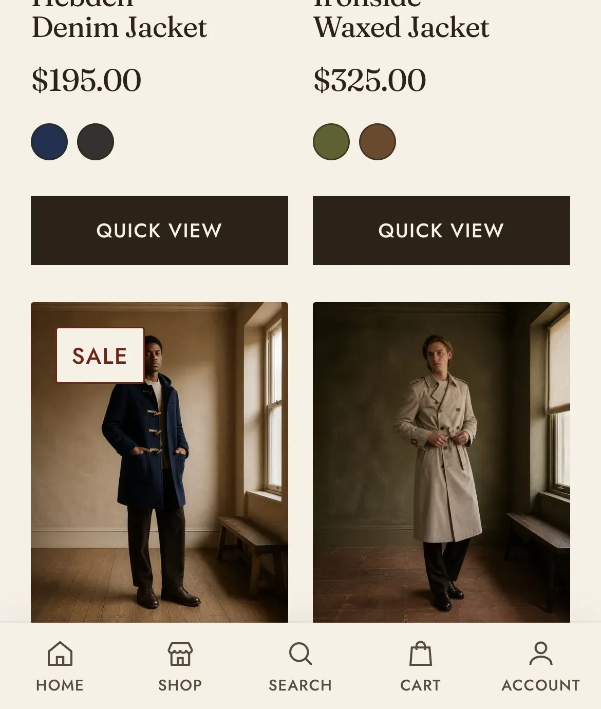
A strip of icon controls fixed to the bottom of the screen, on phones only. Each block is one control, and they sit where a thumb already is rather than at the top of the screen where the header is.
This is an overlay section. It lives in the theme’s Overlay group rather than on a template, so it appears on every page of the store at once. It does not ship switched on. You add it.
What it does: Puts the four or five things a shopper does most within reach on a small screen. On a phone the header is a long way from the thumb, and a shopper who has scrolled has to go back up to reach anything in it.
Add it
Section titled “Add it”Open Online Store → Themes → Customize, expand the Overlay group in the sidebar, and click Add section. Pick Mobile navigation bar, which is filed under Overlay. It arrives with five controls: Home, Shop, Search, Cart and Account.
Key settings (in the section’s settings):
| Setting | What it does | Default |
|---|---|---|
| Color scheme | The bar’s ground and ink. | scheme-paper |
| Show labels | Prints a word under each icon. With it off the bar is icons alone and takes less height. | On |
| Show after scrolling | How far the page scrolls before the bar appears, 0 to 600px. Set it to 0 to show it from the moment the page loads. | 100px |
Blocks: up to 5, of four kinds.
| Block | What it does | Settings |
|---|---|---|
| Link | Any destination you choose. | Icon (Home, Storefront, Grid, Tag, Heart, Journal, or Map pin), plus Label and Link |
| Search | Opens the search drawer. | Label, or leave it empty for the theme’s own wording |
| Cart | Opens the cart, carrying a live count. | Label, or leave it empty |
| Account | Goes to the customer account. | Label, or leave it empty |
Search, Cart and Account need no configuring. They are wired to the same things the header’s own controls are, so the cart count, the search drawer and the account link all behave identically.
The bar appears on phones only. On wider screens the header is still visible, so a second navigation bar would be redundant. There is no setting for this, and nothing to switch off on a desktop.
Related: Header · Search · Cart drawer · Navigation and menus · Lapels support replies within 12 hours.