Newsletter popup
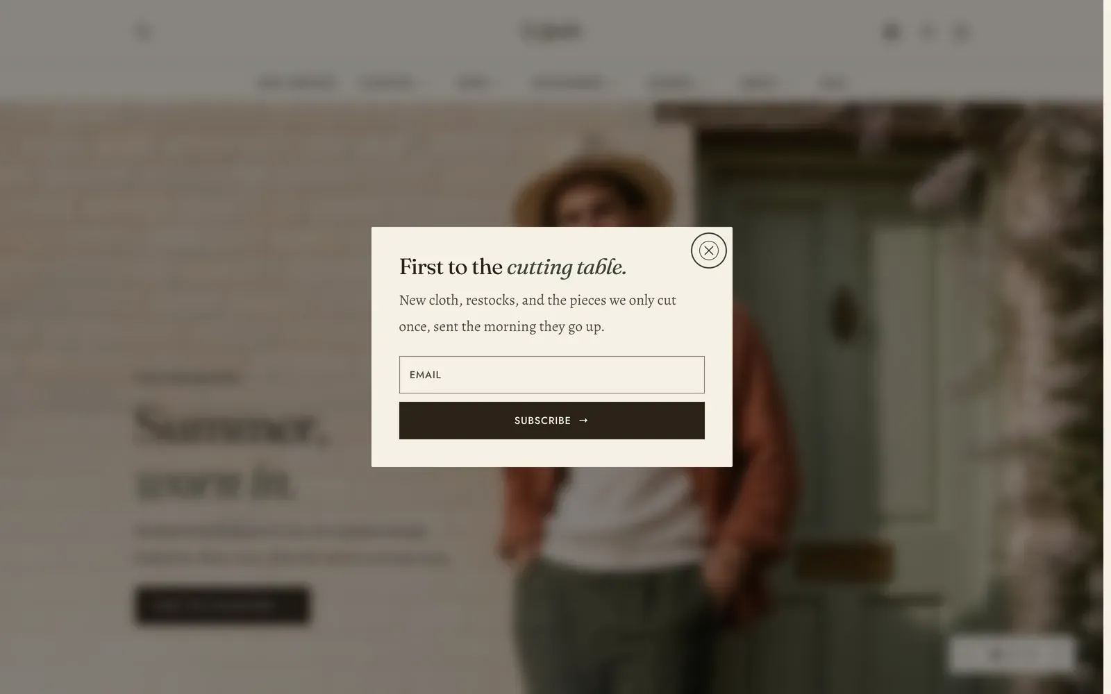
The newsletter popup is the one panel in Lapels that opens itself. Everything else in the Overlay group waits to be asked for. This one arrives uninvited, which is why almost all of its settings are about when, and how often.
Unlike the cart drawer, the search drawer and the quick view, the popup is a section you add. Open Online Store → Themes → Customize, open the Overlay group at the foot of the section list, choose Add section, and pick Newsletter popup. You can have one, and you can remove it again.
What it does: Asks for an email address at a moment of your choosing, once, and remembers the answer. That holds whether the answer was a signup or a dismissal.
Behavior
Section titled “Behavior”| Setting | What it does | Default |
|---|---|---|
| Enable popup | Draws the popup at all. Turn it off to pause it without losing what you have written. | On |
| Open behavior | After a delay, After scrolling, or When they go to leave. The last one is desktop only. It fires when the pointer leaves for the address bar, and a touch screen has no such gesture. | After a delay |
| Delay | How long to wait, 2–60 seconds. Shown only when the trigger is After a delay. | 12 s |
| Scroll depth | How far down the page the shopper has to get, 10–90%. Shown only when the trigger is After scrolling. | 40% |
| Ask again after | How long the popup leaves a shopper who dismissed it alone, 1–90 days. | 30 days |
| Pages | Every page or Home page only. | Every page |
The delay is counted from the visitor’s first move, such as a scroll, a tap or a key, rather than from the moment the page arrived. Twelve seconds therefore means twelve seconds somebody spent on your store, not twelve seconds the page took to load, and a visitor who opens a tab and walks away is never asked.
Two triggers have a floor under them, because they can be asked for on a page that cannot answer them. After scrolling on a page too short to scroll, and When they go to leave on a touch screen, which has no pointer to leave with, both fall back to opening after 20 seconds.
The popup also refuses to interrupt. If another panel is already open, such as the cart drawer, or the shopper is part-way through typing in a field, it stands down and waits for that to finish rather than landing on top of it.
Content
Section titled “Content”| Setting | What it does | Default |
|---|---|---|
| Heading | The panel’s headline. Accepts light formatting, and the shipped copy italicizes the second half. | First to the cutting table. |
| Text | Body copy under the heading. | New cloth, restocks, and the pieces we only cut once, sent the morning they go up. |
| Show policy note | A line under the button linking to your store’s privacy policy and terms of service. | Off |
The policy note is built from your store’s own published policies rather than typed, so it can never promise a page that does not exist. With neither policy published under Settings → Policies, the line does not appear. With one of the two published, it names only that one.
Layout
Section titled “Layout”| Setting | What it does | Default |
|---|---|---|
| Media type | Image or Video. | Image |
| Image | Optional. The centered popup puts it in a band above the text. The split popup puts it in the column beside. | None |
| Video | A film uploaded to Shopify, used when Media type is Video. | None |
| YouTube or Vimeo URL | Or an embed link. | None |
| Captions file | A WebVTT (.vtt) file, for a film with sound. Upload it to Content → Files first. | None |
| Poster image | The still shown before play. | None |
| Autoplay | Off by default. A panel that opens itself and then starts playing is a lot to hand somebody at once. | Off |
| Play as loop | Repeats the film. | On |
| Layout | Centered or Split. The split layout needs an image. Without one it opens centered. | Centered |
| Width | Narrow, Normal, Wide or Extra wide. | Normal |
| Inherit color scheme | Follows the drawer color scheme under Theme settings → Colors, so the popup and the cart drawer match. | On |
| Color scheme | The popup’s own color scheme. Shown only when Inherit color scheme is off. | The theme’s paper scheme |
Blocks: none. The panel is a fixed composition.
What is remembered, and for how long
Section titled “What is remembered, and for how long”Two different answers, remembered two different ways, both in the shopper’s own browser.
- A dismissal is remembered for the period you set in Ask again after. A dismissal means the cross, Esc, or a click on the dimmed page behind. That memory is keyed to the heading and the text, so rewriting either starts everyone fresh. A shopper who closed the spring offer should meet the autumn one.
- A signup is remembered for good, and it counts whichever form they used. A shopper who has already subscribed through the footer or through a Newsletter section on a page never sees the popup at all.
Submitting the form reloads the page, so the popup reopens once on the way back to show the result. That is the thank-you, or an error they can still fix. It reopens only for the visitor who submitted from the popup itself, never for someone who used the footer form on the same page.
Where the subscribers go
Section titled “Where the subscribers go”The form adds each signup straight to your Shopify Customers list, tagged newsletter. Subscribers appear under Customers in your Shopify admin, and you can filter or segment on that tag when you build a mailing list. That works in Shopify Email, or in whichever marketing app you use. Nothing is stored by the theme.
The Newsletter section and the footer signup do the same thing with the same tag, so all three feed one list.
In the theme editor
Section titled “In the theme editor”Nothing opens itself in the editor. A panel that reappeared every few seconds over the section you are editing would be unusable. Select Newsletter popup in the sidebar and it opens. Deselect it and it closes. The popup is also rendered in the editor even when Show the popup is off, so you can keep working on copy you have paused.
Related: Newsletter · Age verification · Cart drawer · Lapels support replies within 12 hours.