Tabs banner
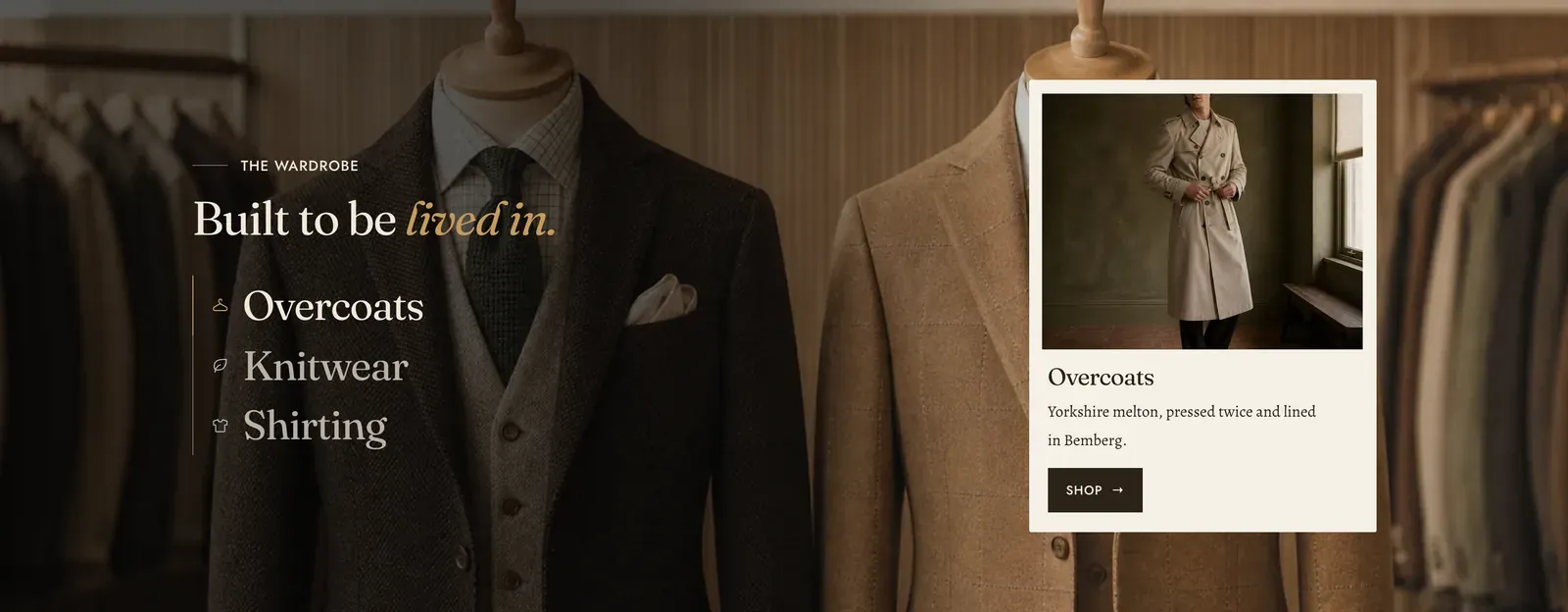
One banner that changes as you pick from a short list. Each Tab block names a collection, brings its own full-bleed picture, and opens a card of copy over it. The heading and label sit above. The picture and the card change underneath.
What it does: Puts three to five ways into the store in the space of one banner, so a visitor chooses a direction instead of scrolling past a single one they did not want.
Key settings (in the section’s settings):
| Setting | What it does | Default |
|---|---|---|
| Color scheme | Section colors. | scheme-paper |
| Heading width | Narrow, Normal, Wide, or Full width. | Normal |
| Heading alignment | Left, center, or right. | Left |
| Subheading | The small label above the heading. | ”The wardrobe” |
| Heading | The headline. Italicize a word to set it in the emphasis font. | ”Built to be lived in.” |
| Intro text | An optional line under it. | Empty |
| Use as the page heading | Makes this the page’s main heading. Turn it on only if the section opens the page. | Off |
| Height | Short, Medium, or Tall. | Medium |
| Card position | Whether the card sits at the Start or the End of the banner. | End |
| Style | How the picture is washed behind the card. Choose None, Half, or Full. | Half |
| Strength | Soft, Medium, or Strong. | Medium |
Blocks: Tab, up to 5.
| Setting | What it does | Default |
|---|---|---|
| Icon | A mark beside the tab name, or None. | Hanger |
| Name | What the tab is called. | ”Overcoats” |
| Collection | Where the tab’s button goes, and where its pictures come from if you leave them empty. | Empty |
| Media type | Image or Video for the full-bleed background. | Image |
| Background image / Video | The banner picture behind the card. | Empty |
| Mobile image | An optional file cropped for narrow screens. | Empty |
| Card media type, Image, Video | The small picture inside the card. | Image |
| Heading and Text | The card’s copy. | ”Overcoats” |
| Button label | The card’s button. | ”Shop” |
| Link | Where the button goes. Leave it empty and it uses the collection. | The collection |
When to use it: Use it at the top of a home page where the store has three or four clear departments. If the tabs should reveal products rather than a banner, use Collection tabs or Product tabs. If there is only one department to show, use Media hero.
Related: Collection tabs · Product tabs · Slideshow tabs · Media hero · Lapels support replies within 12 hours.