Collection list
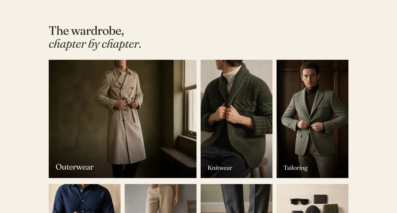
A grid of collections. Each Collection block is one card: a photograph with the collection’s name set over it, washed enough to keep the name legible.
What it does: Lays out the whole shape of the store at once. Unlike a carousel, nothing is hidden off the edge. A visitor sees every department without moving anything.
Key settings (in the section’s settings):
| Setting | What it does | Default |
|---|---|---|
| Color scheme | Section colors. | scheme-paper |
| Heading width | Narrow, Normal, Wide, or Full width. | Wide |
| Heading alignment | Left, center, or right. | Left |
| Subheading | An optional small label above the heading. | Empty |
| Heading | The headline. Italicize a word to set it in the emphasis font. | ”The wardrobe, chapter by chapter.” |
| Intro text | An optional line under it. | Empty |
| Columns on desktop | 2 to 4. Phones always show one column. | 4 |
| Image height | Short, Normal, Medium, or Tall. | Normal |
| Overlay strength | How hard the picture is washed so the name stays readable. Choose Soft, Medium, or Strong. | Medium |
The section also carries a Section spacing group. Pick a Device of Desktop or Mobile, then set Top and Bottom padding from 0 to 200px. Desktop starts at 96px and mobile at 56px.
Blocks: Collection, plus a Custom Liquid block that fills a cell of the grid.
| Setting | What it does | Default |
|---|---|---|
| Collection | Which collection the card opens. | Empty |
| Image | Optional. Falls back to the collection’s own image. | Empty |
| Heading | Optional. Takes the place of the collection name. | Empty |
When to use it: Use it when the store has four to eight departments and you want them all visible. With more than eight, or where the page is already long, Collection carousel holds them in one row instead.
Related: Collection carousel · Collection tabs · Featured collection · Lapels support replies within 12 hours.