Cart drawer
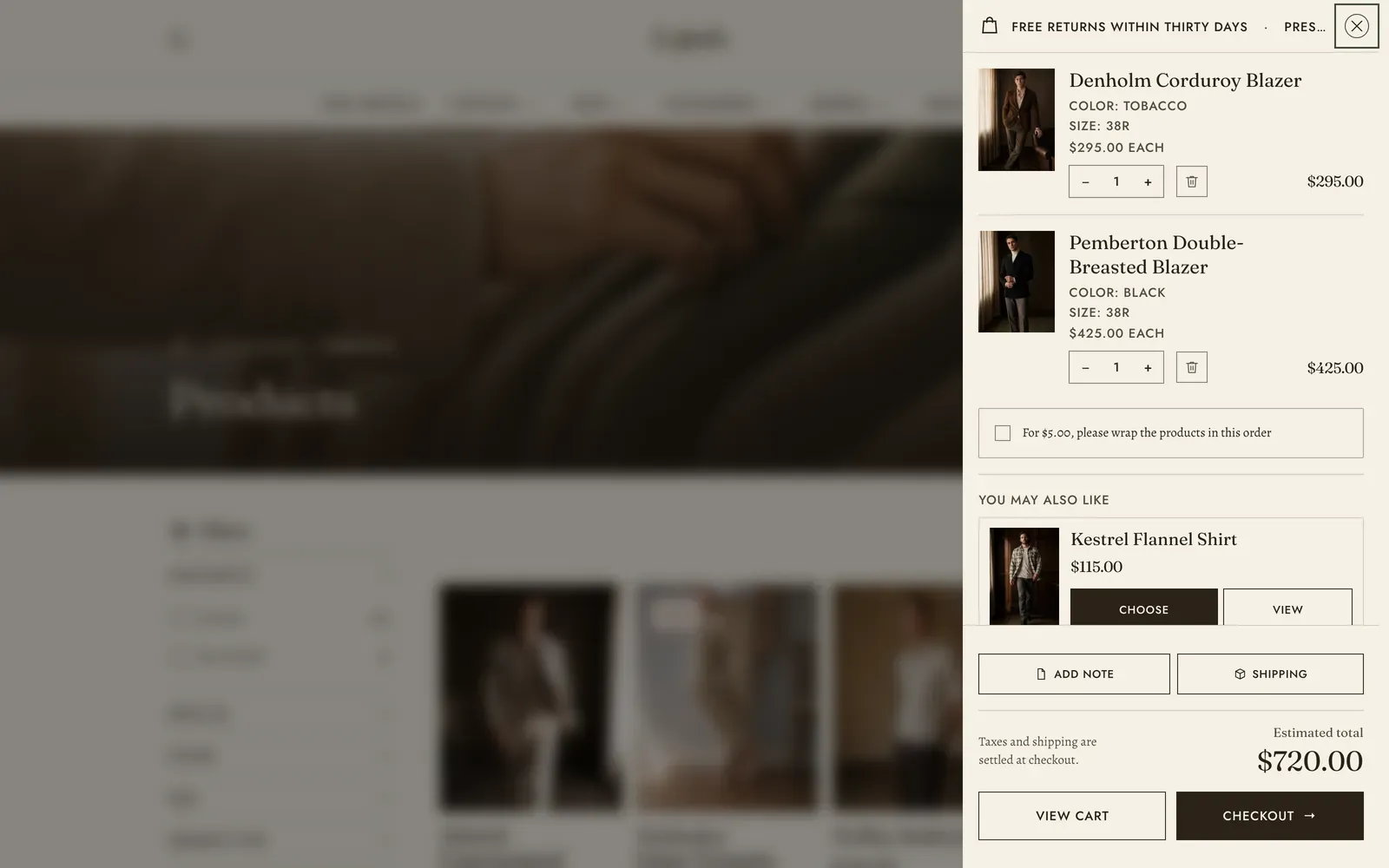
The cart drawer is the slide-in cart that opens from the side of the screen when a shopper adds a product. It is theme chrome rather than content: it lives in the Overlay section group, it is always present, and you configure it rather than add it.
To reach it, open Online Store → Themes → Customize, then open the Overlay group at the foot of the section list and select Cart drawer. Selecting it opens the panel in the preview, so what you change is in front of you while you change it. There is no Remove section control on it. The drawer is part of the theme, not a section you placed.
What it does: Keeps a shopper on the page they were browsing when they add something, and shows them the cart they have just changed. It then offers the two ways on: back to the full cart page, or straight to checkout.
Switching it on
Section titled “Switching it on”The drawer is drawn only when Theme settings → Cart → Cart type is set to Drawer, which is the default. Set it to Page and no drawer is built at all. The cart mark in the header becomes a plain link to your cart page. Adding a product updates the count on that mark where the shopper stands, rather than opening anything. See Cart.
The cart page exists either way, and the drawer’s View cart button links to it. For the full-page cart and its own options, see Cart page.
What the drawer shows
Section titled “What the drawer shows”Per line in the cart:
- Product image, product title, and the option values (size, color, and so on) whenever the product has more than one variant.
- The subscription or selling-plan name, and any line-item properties an app has attached. Internal properties, the ones whose name starts with an underscore, are hidden.
- The price of one unit, plus the measured unit price for products sold by weight or volume.
- A quantity stepper and a remove control. If the variant tracks inventory and does not allow overselling, the stepper stops at the stock available and says why.
- The line total, with the sale price and a struck-through original when the line is discounted.
- Any line-level automatic discount, named and totalled under the line.
Under the lines sit the gift wrapping offer and the recommendation shelf, both covered below. The foot carries any cart-level discounts, the Estimated total, a note about tax and shipping, and the View cart and Checkout buttons. Any accelerated checkout buttons the store has switched on stack underneath.
When the cart is empty the drawer shows the empty-cart message and a link into the catalog instead.
Header
Section titled “Header”The drawer’s top row carries the cart mark, the announcement if you have written one, and the close control. It is the one row you can color on its own. Everything else in the drawer follows the drawer color scheme set in Colors.
| Setting | What it does | Default |
|---|---|---|
| Inherit color scheme | Uses the drawer’s own color scheme for the header row. Turn it off to set that row apart from the items below it. | On |
| Color scheme | The color scheme for the header row. Shown only when Inherit color scheme is off. | The theme’s paper scheme |
Announcement
Section titled “Announcement”A short line that sits on the header row beside the cart mark and takes the place of the word Cart there. Use it for what a shopper needs to know before checkout, such as a returns window, a delivery cut-off, or a shipping threshold. It takes no links on purpose, because a link there sends the shopper out of a cart they are partway through.
| Setting | What it does | Default |
|---|---|---|
| Enable announcement | Draws the announcement on the header row. | Off |
| Rotation speed | How long each message holds before the next one rises, 3–12 seconds. Only matters once you have written more than one. | 3 s |
| Message 01 | The first line. | Free returns within 30 days |
| Message 02 | An optional second line. | None |
| Message 03 | An optional third line. | None |
The row is narrow, so keep each message short: anything longer ends in an ellipsis. Messages rotate only from two upwards, the rotation stops while the pointer is over it or focus is inside it, and for a visitor whose system asks for reduced motion every message simply sits on the strip together.
Free shipping
Section titled “Free shipping”| Setting | What it does | Default |
|---|---|---|
| Enable free shipping | Draws the progress bar toward free shipping at the top of the drawer’s foot. It is only half the switch, as explained below. | Off |
The amount itself is not here. You name it once for the whole theme, under Theme settings → Cart → Free shipping starting from, so the drawer and the cart page can never promise a shopper two different figures. This switch decides only whether the bar appears in the drawer. The cart page has a switch of its own.
Four things have to be true before the bar draws: Enable free shipping here, Enable free shipping in Theme settings → Cart, a threshold above zero, and something in the cart. All of them ship off or at zero, so the bar is opt-in. See Cart and gift wrapping.
The bar is drawn only when the threshold is above zero and the cart has something in it. A shopper buying in another currency sees the amount converted at the current rate.
Controls
Section titled “Controls”Two quiet buttons above the totals, each of which raises a small panel over the cart.
| Setting | What it does | Default |
|---|---|---|
| Show the order note | Adds an Add note button that opens a note field. The note is saved to the cart as it is typed, so nothing has to be submitted. | On |
| Show the shipping estimator | Adds a Shipping button that asks for a country, region and postal code and returns the store’s own rates for that address. | On |
Rates come from the store’s shipping zones, so an address you do not ship to answers No delivery to this address. While one of these panels is up, the cart behind it is held still. One thing to read, one thing to answer. Closing it hands the shopper back to the cart exactly as they left it.
Gift wrapping
Section titled “Gift wrapping”| Setting | What it does | Default |
|---|---|---|
| Offer gift wrapping | Shows the gift wrap checkbox with the goods, once there is something in the cart to wrap. | On |
Gift wrapping needs a wrapping product named in Theme settings → Gift wrapping. With that empty there is nothing to offer, and nothing is drawn. Turning this switch off withholds the offer in the drawer only, and leaves it standing on the cart page.
The offer is a card rather than a switch, because a charge on a Shopify cart is a line and a line is a product. Ticking the box adds the wrapping product to the cart, at which point the card is gone and the wrapping is an ordinary line with its own remove control. It is withheld wherever it could not be taken up: an empty cart, wrapping already in the cart, or a wrapping product that is sold out or unpublished.
Recommendations
Section titled “Recommendations”A scrollable shelf of suggestions at the end of the goods, built by Shopify from the most recent thing the shopper added. One suggestion is on screen at a time and nothing advances on its own: the shopper swipes it, drags it, steps it with the arrows, or scrolls the track from the keyboard.
| Setting | What it does | Default |
|---|---|---|
| Show recommendations | Draws the shelf at the end of the drawer. | On |
| Heading | The shelf’s heading. Leave it empty for You may also like, or Pairs well with when the source is complementary. | None |
| Source | Related products (Shopify builds these from what shoppers buy together) or Complementary products (you choose these yourself, in Shopify’s Search & Discovery app). | Related products |
| Products count | The most that will fit on the shelf, 2–8. Fewer appear when there are fewer to suggest. | 6 |
The shelf leaves out anything sold out, anything already in the cart, and the gift wrap product. If that leaves nothing to show, no shelf appears.
The cards themselves are drawn by a hidden section called Cart recommendations. It never appears in the section picker and has no settings of its own, because everything about the shelf is set here, on the drawer.
The cards follow Theme settings → Product cards. The image shape follows Theme settings → Cart → Image ratio, which the drawer, the cart page and this shelf all share, so a shopper crossing the three never sees a photograph re-cut.
Blocks: none. The drawer is a fixed composition.
Keyboard and screen readers
Section titled “Keyboard and screen readers”The drawer is a real dialog. Opening it moves focus to the close button, Esc closes it, so does a click on the dimmed page behind, and Tab cycles inside the panel rather than escaping to the page underneath. Closing returns focus to the control that opened it, and the page behind never scrolls while it is open. Whether that page is blurred is set by Theme settings → Modals → Blur the page behind. See Modals.
Related: Cart · Cart page · Quick view · Lapels support replies within 12 hours.