Quick view
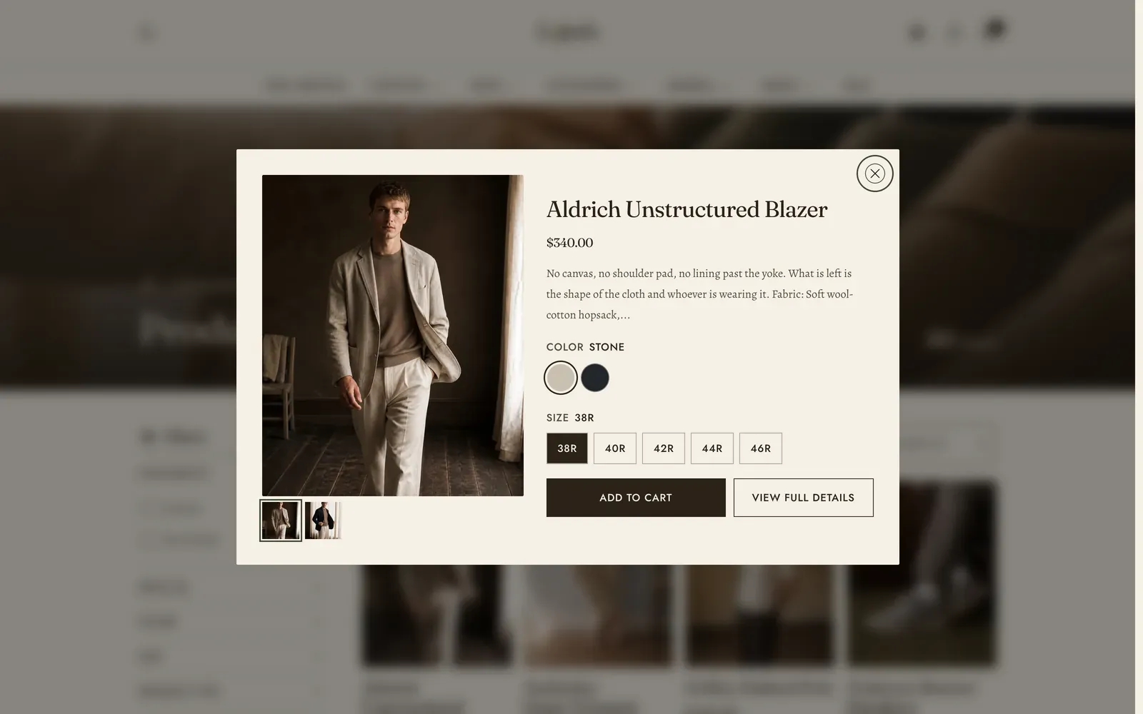
Quick view is the panel that opens over a product grid when a shopper presses the quick button on a card, or one of the card’s color swatches. Like the cart and search drawers it is theme chrome: it lives in the Overlay section group, it is always present, and you configure it rather than add it.
To reach it, open Online Store → Themes → Customize, then open the Overlay group at the foot of the section list and select Quick view. Selecting it opens the panel in the preview, filled with a real product, so you can judge it at the width and color scheme you have set.
What it does: lets a shopper choose a size or a color and add the piece to the cart from the grid, without losing the collection they were reading. It is the difference between browsing forty products and opening forty pages.
Switching it on
Section titled “Switching it on”The panel is drawn only when Theme settings → Product cards → Quick button action is set to Quick view, which is the default. The alternative, Add to cart / Choose options, adds single-variant products straight to the cart and sends products with options to their own page, and with that chosen no quick view panel is output at all.
Two things on a card open it. The quick button revealed over the card image, and the card’s color swatches. A swatch opens the panel already on the color that was pressed. Both are controlled under Theme settings → Product cards. See Product cards.
Key settings
Section titled “Key settings”| Setting | What it does | Default |
|---|---|---|
| Inherit color scheme | Follows the drawer color scheme set under Theme settings → Colors, so the quick view and the cart drawer match. | On |
| Color scheme | The panel’s own color scheme. Shown only when Inherit color scheme is off. | The theme’s paper scheme |
| Width | How wide the panel opens on a large screen, 640–1200 px. It always fits narrower ones. | 928 px |
| Preview product | Fills the panel here in the theme editor only. Shoppers always see the product they pressed. Leave it empty to preview your first product. | None |
Blocks: none. The panel is a fixed composition.
What the panel shows
Section titled “What the panel shows”The body is fetched from the product’s own page as the panel opens, so what a shopper gets is the same variant picker and the same buy button the product page uses.
- The full media gallery, with thumbnails, and swipe or drag between frames when there is more than one. Video and 3D models play here as they do on the product page.
- Vendor, when Show vendor is on under Theme settings → Product cards.
- The product title, which is itself a link to the full product page.
- Price, with the sale and compare-at treatment, and the star rating when Show rating is on and the product carries review data.
- A short description excerpt, cut to about 28 words.
- The variant picker, and for a gift card the recipient fields.
- Add to cart, beside View full details, which goes to the product page.
What the panel deliberately leaves out is everything a quick look does not need: a quantity stepper, accelerated wallet checkout, and sharing. Those are one press away on the page it links to.
A product you have marked as available on a subscription plan only cannot be added from here, because there is no purchase-option selector in the panel. So the panel drops the form altogether and promotes View full details to the only action.
While the body is on its way the panel draws a skeleton shaped from what the card already knows: how many option rows the product has, and how many photographs. What arrives lands on the shape that was already there instead of shoving it.
The cards themselves and their quick button are covered in Product cards. The full product page is covered in Product page.
Keyboard and screen readers
Section titled “Keyboard and screen readers”Opening the panel moves focus to the close button, which is there from the first moment, so the panel can be dismissed while it is still filling in. Esc closes it, so does a click on the dimmed page behind, and Tab cycles inside the panel. Closing returns focus to the card control that opened it, so a shopper who closes the panel is back where they were in the grid.
Related: Product cards · Product page · Cart drawer · Lapels support replies within 12 hours.