Multicolumn
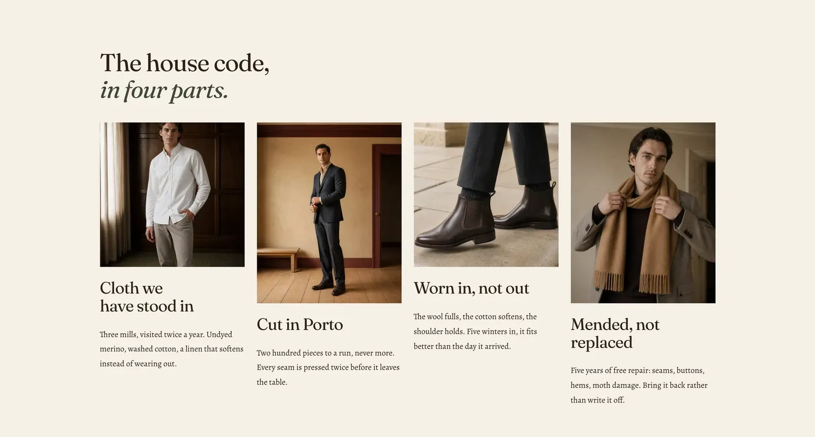
A row of columns with nothing in them until you say so. Each Column block is an empty frame that takes the same content blocks as the rest of the theme. So a column can be a picture and a paragraph, or a heading, three icon rows and a button.
What it does: Gives you a grid without deciding what goes in it. Every other multi-item section in Lapels fixes the shape of its items. This one does not.
Key settings (in the section’s settings):
| Setting | What it does | Default |
|---|---|---|
| Color scheme | Section colors. | scheme-paper |
| Heading width | Narrow, Normal, Wide, or Full width. | Wide |
| Heading alignment | Left, center, or right. | Left |
| Subheading | An optional small label above the heading. | Empty |
| Heading | The headline. Italicize a word to set it in the emphasis font. | ”The house code, in four parts.” |
| Intro text | An optional line under it. | Empty |
| Columns on desktop | 2 to 4. | 4 |
| Columns on mobile | 1 to 3. | 1 |
| Alignment | Left or Center. | Left |
| Gap | The space between columns, 24 to 80px. | 24px |
The section also carries a Section spacing group. Pick a Device of Desktop or Mobile, then set Top and Bottom.
Blocks: Column.
| Setting | What it does | Default |
|---|---|---|
| Width | Single takes one column of the grid. Wide takes two. | Single |
| Inherit color scheme | On, the column takes the section’s colors and draws no box. Turn it off to give one column its own scheme. That is how you make a single column read as a panel. | On |
| Color scheme | The column’s own colors, once inheriting is off. | scheme-paper |
Inside each column, add any content block. Those are Heading, Text, Icon with text, Image, Video, Button, Group, Countdown, Deal countdown, Trust badges, Testimonial, Divider, Spacer, and Custom Liquid.
When to use it: Use it when no purpose-built section fits. That usually means mixed content that happens to want three or four columns. When the columns would all be an icon, a heading and a line, use Icon list, which is built for exactly that and is far quicker to fill in.
Related: Content blocks · Icon list · Feature tiles · Text columns · Lapels support replies within 12 hours.