Product tabs
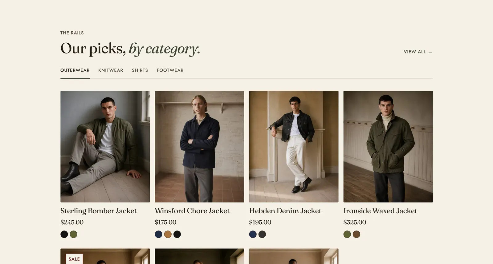
Several collections stacked behind one row of tabs, each opening a grid of its products. Each Collection block is one tab.
What it does: Puts four departments’ worth of product on a page without four sections of scrolling. The visitor changes departments in place, and the page does not move under them.
Key settings (in the section’s settings):
| Setting | What it does | Default |
|---|---|---|
| Color scheme | Section colors. | scheme-paper |
| Heading width | Narrow, Normal, Wide, or Full width. | Wide |
| Heading alignment | Left, center, or right. | Left |
| Subheading | The small label above the heading. | ”The rails” |
| Heading | The headline. Italicize a word to set it in the emphasis font. | ”Our picks, by category.” |
| Intro text | An optional line under it. | Empty |
| Products per tab | 2 to 12. | 8 |
| Columns on desktop | 2 to 5. | 4 |
| Show the “View all” link | The link to the whole of whichever collection is open. | On |
The section also carries a Section spacing group. Pick a Device of Desktop or Mobile, then set Top and Bottom.
Blocks: Collection, up to 6.
| Setting | What it does | Default |
|---|---|---|
| Collection | The department this tab opens. | Empty |
| Tab label | Leave it empty to use the collection name. | The collection name |
When to use it: Use it as the main product section of a home page for a store with several clear departments. When the departments need a sentence of explanation rather than just products, use Collection tabs. When there is only one collection to show, use Featured collection, which carries up to three behind tabs of its own.
Related: Collection tabs · Featured collection · Product carousel · Lapels support replies within 12 hours.