Collection tabs
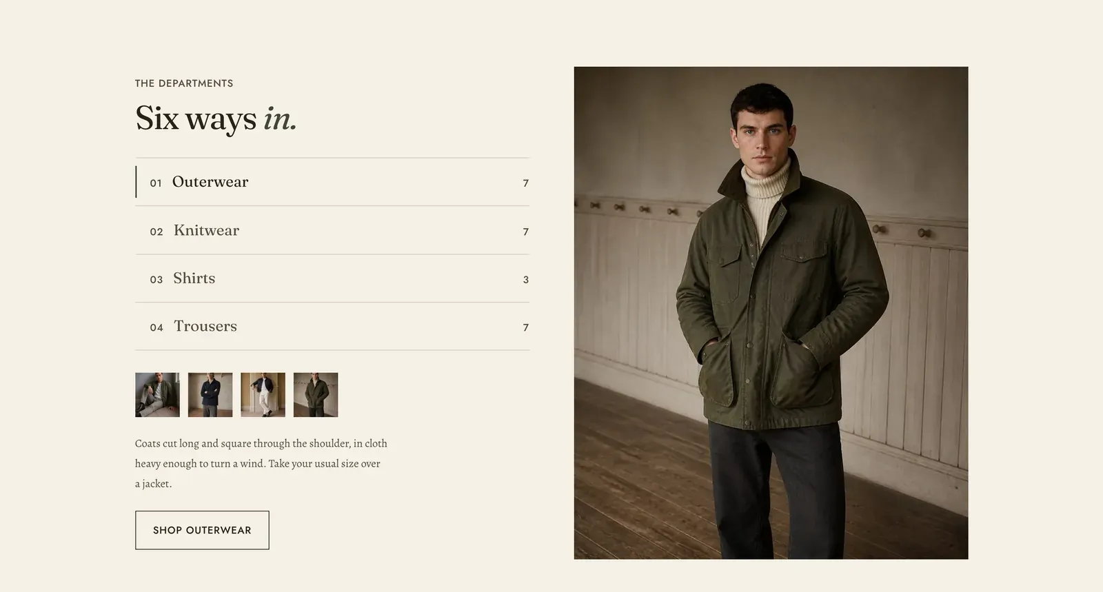
A numbered list of departments on one side, and on the other whatever the chosen one contains. Each Collection block is one tab, carrying its own description, its own picture and a strip of thumbnails from the collection itself.
What it does: Lets a visitor read about a department before entering it. A collection grid shows pictures and names. This shows a sentence explaining what the department is and who it is for. That is what a customer new to the store actually needs.
Key settings (in the section’s settings):
| Setting | What it does | Default |
|---|---|---|
| Color scheme | Section colors. | scheme-paper |
| Heading width | Narrow, Normal, Wide, or Full width. | Normal |
| Heading alignment | Left, center, or right. | Left |
| Subheading | The small label above the heading. | ”The departments” |
| Heading | The headline. Italicize a word to set it in the emphasis font. | ”Six ways in.” |
| Intro text | An optional line under it. | Empty |
| Image position | Right or Left. | Right |
| Image ratio | Portrait (4 by 5), Square (1 by 1), or Landscape (3 by 2). | Portrait |
| Product preview count | How many thumbnails from the collection to show under the description, 0 to 6. Set it to 0 for a description with no products. | 4 |
| Show pieces count | Prints how many products each tab holds, beside its name. | On |
The section also carries a Section spacing group. Pick a Device of Desktop or Mobile, then set Top and Bottom.
Blocks: Collection, up to 6.
| Setting | What it does | Default |
|---|---|---|
| Collection | The department. Its products fill the thumbnail strip and its name labels the tab. | Empty |
| Label | Takes the place of the collection name on the tab. | The collection name |
| Image | The large picture beside the description. Falls back to the collection’s own image. | Empty |
| Body | The paragraph explaining the department. This is the reason to use this section rather than a grid. | ”What the department holds, and who it is for.” |
| Link label | The button under the description. | ”Shop” and the collection name |
When to use it: Use it where the departments need explaining rather than just listing. That fits a store whose categories are not obvious, or one that wants to give fit advice up front. To show only products under the tabs, use Product tabs. For a plain grid of departments, use Collection list.
Related: Product tabs · Collection list · Tabs banner · Lapels support replies within 12 hours.