Bar chart
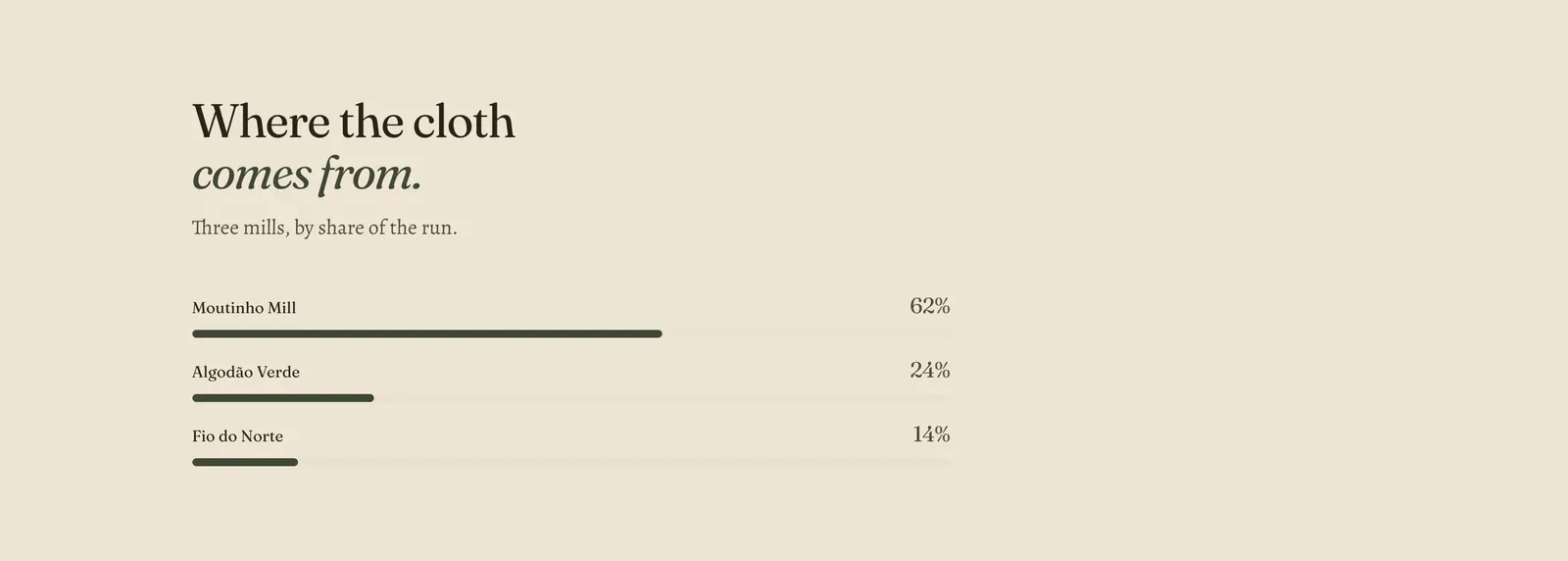
A short set of labeled bars with a figure at the end of each line. Each Bar block is one row.
What it does: Shows quantities that only mean something beside each other, such as where the cloth comes from or what a run is made of. It is a drawn comparison, not a chart. There is no data source behind it. You type the label, the figure, and how wide the bar should be.
Key settings (in the section’s settings):
| Setting | What it does | Default |
|---|---|---|
| Color scheme | Section colors. | scheme-ecru |
| Heading width | Narrow, Normal, Wide, or Full width. | Normal |
| Heading alignment | Left, center, or right. | Left |
| Subheading | An optional small label above the heading. | Empty |
| Heading | The headline. Italicize a word to set it in the emphasis font. | ”Where the cloth comes from.” |
| Intro text | A line saying what is being measured. | ”Three mills, by share of the run.” |
The section also carries a Section spacing group. Pick a Device of Desktop or Mobile, then set Top and Bottom padding from 0 to 200px. Desktop starts at 96px and mobile at 56px.
Blocks: Bar, up to 6.
| Setting | What it does | Default |
|---|---|---|
| Label | What the bar stands for. | ”Moutinho Mill” |
| Value | The figure printed at the end of the row. Plain text, so “62%”, “62 of 100” and “two thirds” all work. | ”62%“ |
| Bar width | How far the bar is drawn, 0 to 100%. | 62% |
When to use it: Use it when three to six quantities add up to a story about proportion, and put the total in Intro text so the reader knows what the bars are shares of. For standalone headline figures that are not shares of anything, use Statistics.
Related: Statistics · Spec table · Feature tiles · Lapels support replies within 12 hours.