Featured collection
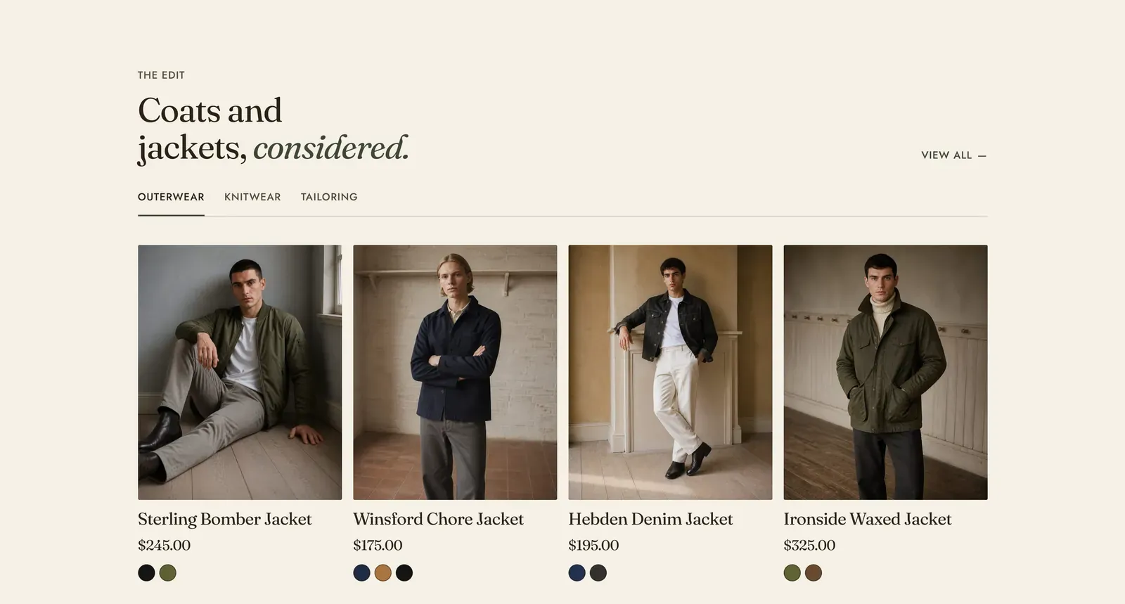
A grid of products from a collection you choose. Add one Collection block and it is a plain grid. Add two or three and the section grows a row of tabs to switch between them.
What it does: Puts real, buyable products on a page that is not a collection page, such as a home page, a landing page or an article. Each card carries the price, the color options and the sale marking the rest of the store uses, so nothing here is a special case.
Key settings (in the section’s settings):
| Setting | What it does | Default |
|---|---|---|
| Color scheme | Section colors. | scheme-paper |
| Products to show | 2 to 12 per collection. | 8 |
| Heading width | Narrow, Normal, Wide, or Full width. | Wide |
| Heading alignment | Left, center, or right. | Left |
| Subheading | The small label above the heading. | ”The edit” |
| Heading | The headline. Italicize a word to set it in the emphasis font. | ”Coats and jackets, considered.” |
| Intro text | An optional line under it. | Empty |
| Columns on desktop | 2 to 5. | 4 |
| Show view all | The link to the whole collection, set at the end of the heading row. | On |
The section also carries a Section spacing group. Pick a Device of Desktop or Mobile, then set Top and Bottom.
Blocks: Collection, up to 3, plus a Custom Liquid block.
| Setting | What it does | Default |
|---|---|---|
| Collection | Which collection to draw products from. | Empty |
| Tab label | Takes the place of the collection name on its tab. Only used when there is more than one. | The collection name |
When to use it: Use it as the main product section of a home page. For the same products in one swipeable row instead of a grid, use Product carousel. To show the departments rather than the products, use Collection list.
Related: Product carousel · Product tabs · Collection list · Product cards · Lapels support replies within 12 hours.