Navigation and menus
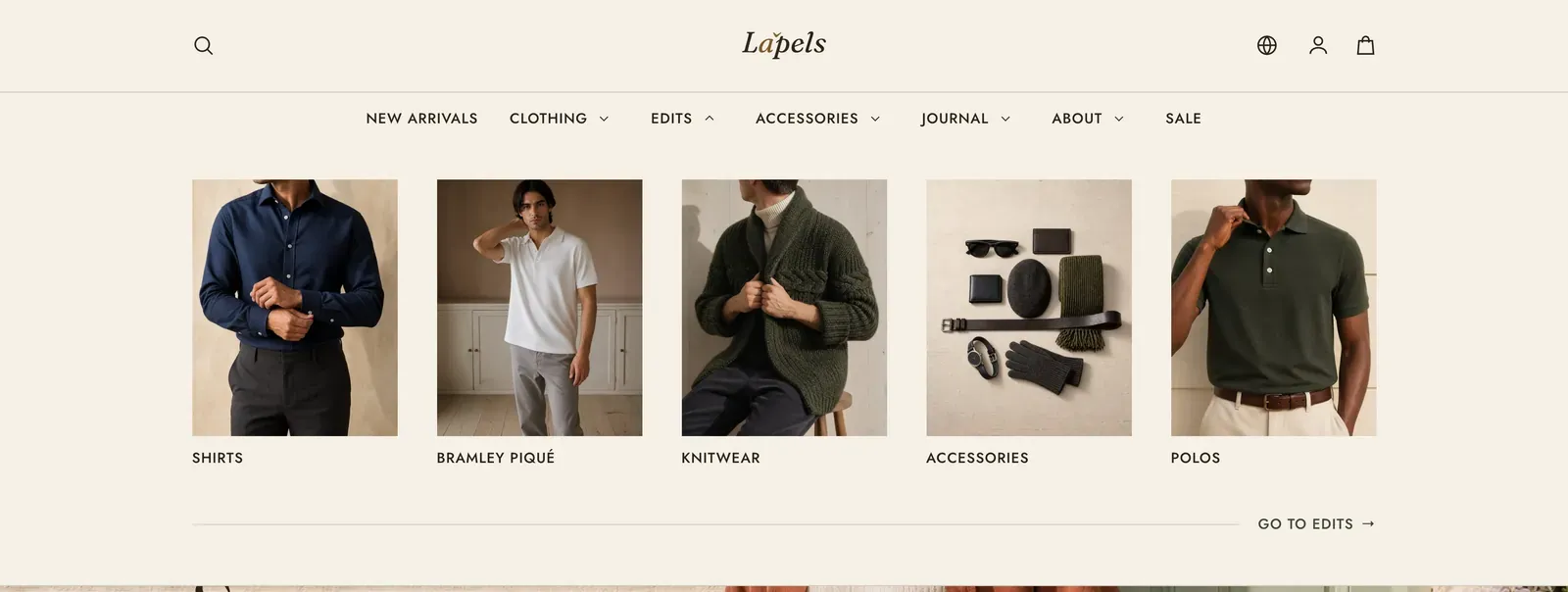
Your navigation is not built in the theme editor. It is built in your Shopify admin under Content → Menus, and the Header section simply points at the menu you want. Lapels then reads the shape of that menu and decides how it should render.
What it does: Turns one menu into every navigation surface the theme needs, without you maintaining a second copy of the menu inside the theme. That covers the desktop bar, its drop-downs, its full-width panels, and the mobile drawer.
Build a menu
Section titled “Build a menu”- In your Shopify admin, go to Content → Menus.
- Open Main menu, the menu every store starts with, or click Add menu to make a new one.
- Add items. Each gets a Name (the visible text) and a Link (a collection, product, page, policy, blog, or an external URL).
- Nest items by dragging one under another. Nesting is what decides the shape Lapels renders.
- Save, then open Online Store → Themes → Customize, select the Header section, and set Main menu to your menu.
Menu edits appear in the editor and on the storefront straight away. There is nothing to republish. The link for the page a visitor is currently on is marked automatically.
Nesting depth decides the shape
Section titled “Nesting depth decides the shape”Lapels reads the depth of each top-level item and renders accordingly. You never pick a “navigation style”. You build the menu, and the shape follows.
| Menu structure | What the visitor gets on desktop |
|---|---|
| A top-level item with no children | A plain link in the navigation band. |
| A top-level item with one level of children | A drop-down panel listing those children, with a chevron on the parent. |
| A top-level item whose children have children of their own | The same drop-down, but each child with sub-items becomes a flyout: a caret on the row, and its own column opening beside it. |
| Any of the above, plus a Mega menu block bound to that item | A full-width panel across the masthead instead of a narrow drop-down. |
A drop-down ends with a link back to the parent item itself, reading “Go to Clothing”, unless you have parked that item on # as a label rather than a destination.
Mega menus
Section titled “Mega menus”A mega menu is a Mega menu block added to the Header section, bound to a top-level menu item by name. The Header holds up to 8 blocks in total, counting mega menus and custom links together. That is the ceiling on how many of your top-level items can open a full-width panel.
To create one, open the Header section in the editor, click Add block, choose Mega menu, and type the top-level item’s name into Main menu item exactly as it reads in your menu. Matching ignores capitals and stray spaces.
The item must already have sub-items in Content → Menus. Lapels will not promote an item with nothing under it, because a full-width panel holding a single link is worse than the link on its own.
The three panel shapes
Section titled “The three panel shapes”Which body a mega panel takes is read off the menu, not set by hand:
| The menu under that item | The panel |
|---|---|
| Any child has children of its own | Titled columns. Each child becomes a column heading and its own children become the links beneath it. Hairline rules separate the columns. |
| Flat children, Show an image on each link on | Image cards. Each link becomes a picture with its label underneath. |
| Flat children, Show an image on each link off | Plain labels. A list read down the panel, filling one column to the foot before starting the next. |
Columns on desktop runs from 2 to 6 and defaults to 4. It is a ceiling rather than a quantity. A short menu settles into fewer columns, and a panel carrying two promotions drops to two, because two promotions and four columns of links leave tracks narrower than the words standing in them.
Between 960px and roughly 1200px, titled columns take four at most, since there is less page to spend. Image cards keep their count at that width, because a picture takes a narrow track without complaint.
Promotions in a panel
Section titled “Promotions in a panel”Each Mega menu block can carry one or two promotions, pinned to the end of the panel: an Image, a Heading, Text, a Link, and a Link label. Fill in nothing and the panel is links alone. Two promotions sit side by side on desktop and stack on mobile.
Promotion images are your own uploads, and they are unaffected by the image ratio described next.
Images in a mega menu
Section titled “Images in a mega menu”Turn Show an image on each link on and each link in a flat panel becomes a card. The picture is not an upload. Lapels borrows it from whatever the link points at.
- A collection link uses the collection’s image, or its first product’s image if the collection has none.
- A product link uses the product’s featured image.
- An article link uses the article’s image.
- Anything else, such as a page, a policy or a plain URL, has no picture to borrow and takes the theme’s placeholder.
So you curate the menu, and the images follow. The trade is that a card borrows a picture taken for somewhere else, so a tall crop cut from a wide source can look softer than a purpose-made upload.
The crop is one decision for the whole theme, in Theme settings → Navigation → Image ratio:
| Option | Shape |
|---|---|
| Tall (2:3) | The tallest crop. |
| Portrait (4:5) | The theme default. |
| Square (1:1) | Even on both axes. |
| Landscape (4:3) | Wider than tall. |
The setting applies to every mega menu card in the theme at once, so all your panels agree. See Navigation.
Cards are for flat menus only. If a menu item carries a third level, Lapels renders titled columns and ignores the card setting. An image above a column heading would push that column’s own links off the bottom of the panel.
On phones and tablets
Section titled “On phones and tablets”Below 960px the navigation band becomes a drawer, opened by the menu button at the start of the masthead. Everything that was a drop-down, a flyout or a mega panel becomes an accordion row inside it, opening one level at a time. So a three-deep menu never unrolls every link under a single tap. Mega menu card images are hidden in the drawer, and the labels remain.
The country and language pickers move to the foot of the drawer at that width, since the bar has no room for a third control beside the wordmark. The account control does not move. It stays in the masthead at every width.
Footer menus
Section titled “Footer menus”The footer uses the same menus. A Footer menu block takes any menu you have built and renders it as a titled list, and unlike the header it publishes sub-items too: a parent with children becomes a group heading with its destinations underneath. See Footer.
Keyboard operation
Section titled “Keyboard operation”Every part of the navigation works without a pointer:
- The Skip to content link is the first stop in the page. Tab once on arrival, press Enter, and focus lands past the whole header on the page’s main content.
- A parent item is two controls: the link, which always navigates to the parent’s own page, and a small expand button beside it, which opens the panel. That split means a keyboard visitor can reach the parent page as easily as its children.
- Escape closes the open panel and returns focus to the button that opened it.
- Moving focus out of an open drop-down closes it, the way a panel hanging over the page should behave. Inside the mobile drawer it stays open, because the next thing tapped is usually inside it.
- The mobile drawer contains focus while open: Tab and Shift+Tab wrap between the menu button and the drawer, and the page behind the scrim is out of reach for screen readers as well as for the tab order.
- In right-to-left languages the whole navigation mirrors, and a flyout column near the edge of the window opens back across its own panel rather than off-screen.
Related: Header · Footer · Navigation · Performance & accessibility · Lapels support replies within 12 hours.